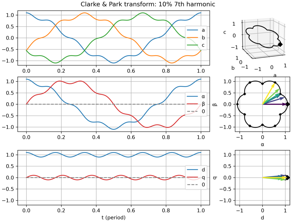
I recently updated an old Python script which I created to visualize the Clarke (αβ) & Park (dq) transformations applied to three-phase signals (voltages or currents). These geometric transforms are at the core of most control approaches for AC motors and grid-connected converters. This work is now publicly available as a Python Jupyter notebook (links below).
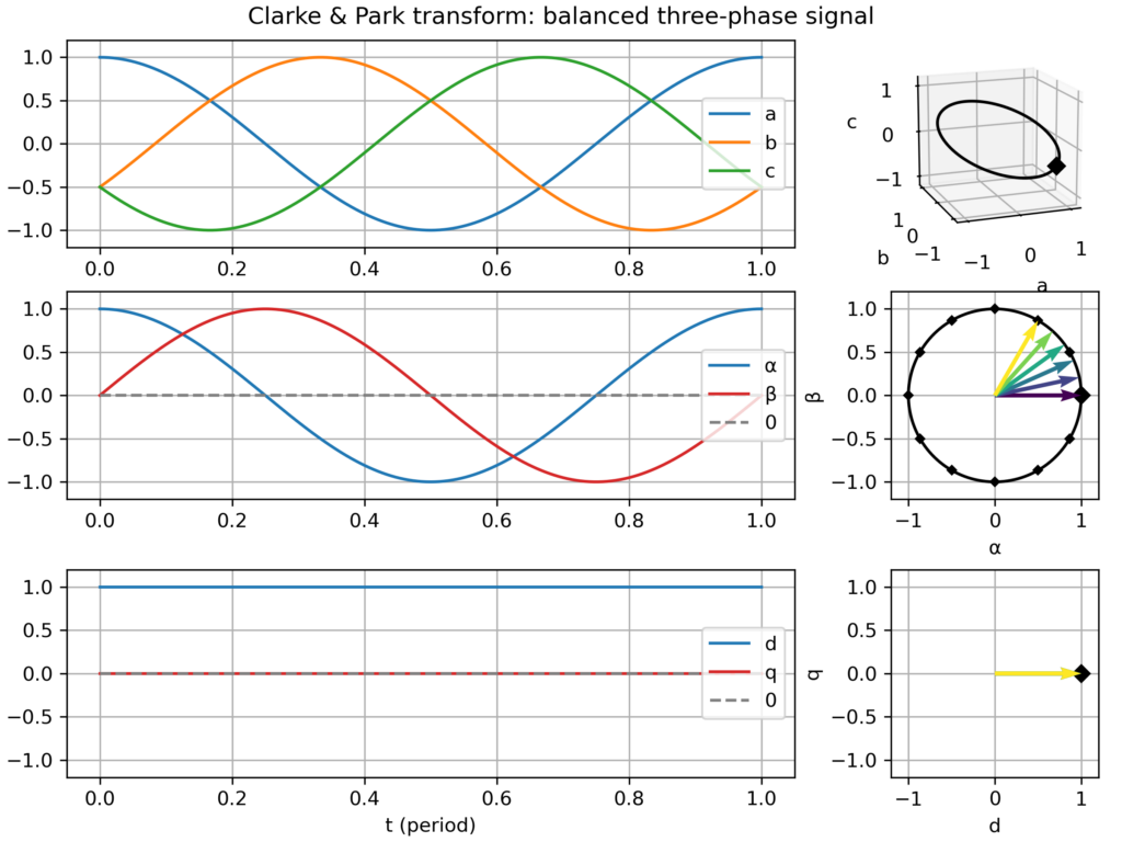
The goal is to “look beyond the math” (beyond the matrices-based definitions) to witness how the different transformations relate to each other (i.e. Park = Clarke + Rotation(−ω.t)) and how different signals get transformed. The plot I created assembles:
time domain plots in the natural (abc), Clarke (αβ) & Park (dq) frames over one electric period
a corresponding plot in the space vector domain (i.e. parametric curve), either in the hard-to-see 3D abc frame, and in the much clearer Clarke (αβ) & Park (dq) frames, where nice 2D geometric figures appear (only a "boring circle" for a balanced three-phase signal, but nice snowflake-like patterns appear with 5th or 7th harmonics!)
Transforms gallery
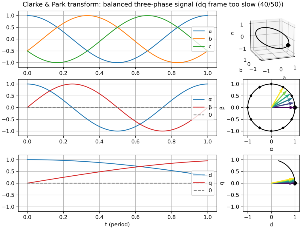
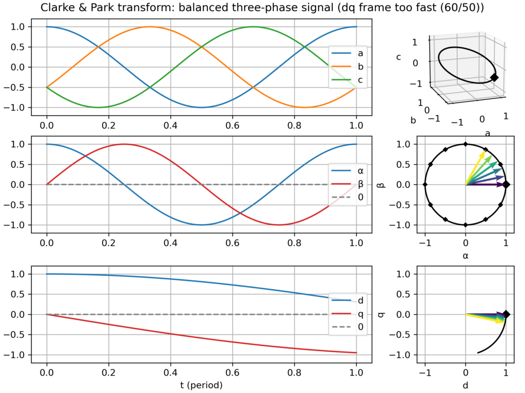
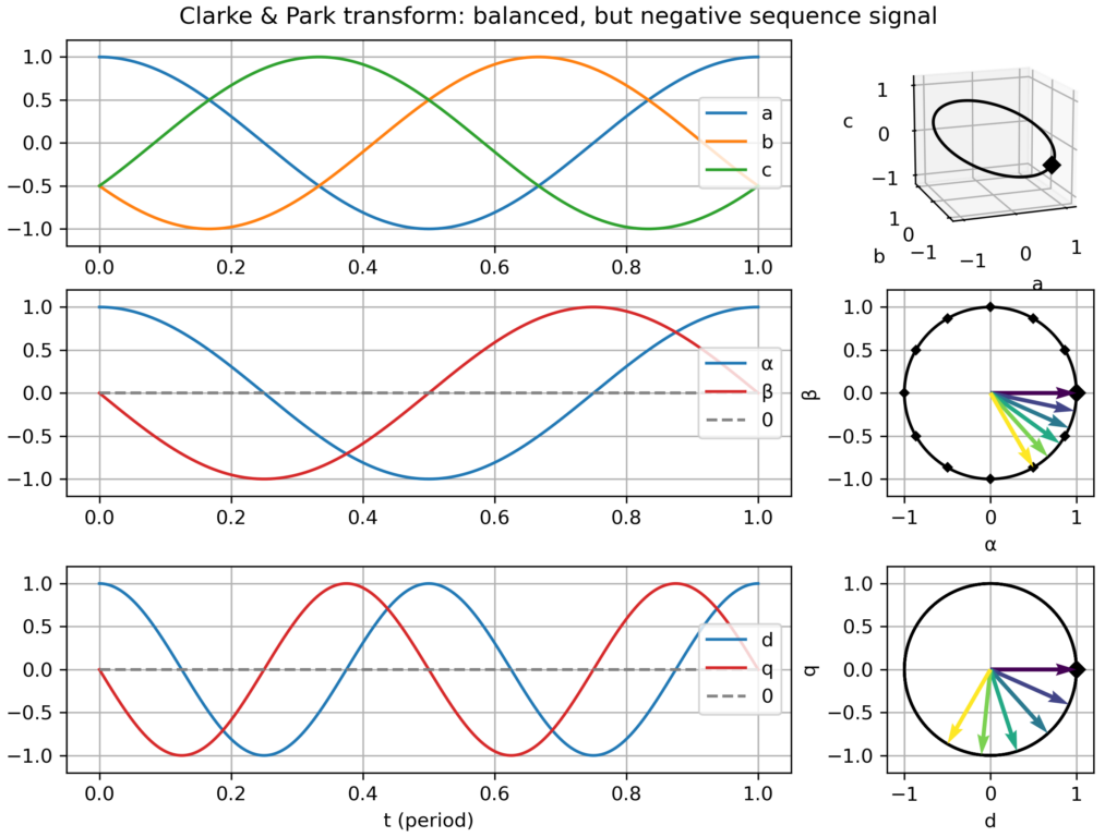
In particular, I saved a series of plots for the following cases:
Balanced three-phase signal
nominal case: speed of the dq frame perfectly matching the signal frequency → perfect circular movement in the αβ plane and static vector in the dq plane
dq frame slightly too slow or too fast → slowly varying vector in the dq plane
negative sequence signal (i.e. negative frequency −ω) → fast varying vector in the dq plane (−2ω apparent frequency)
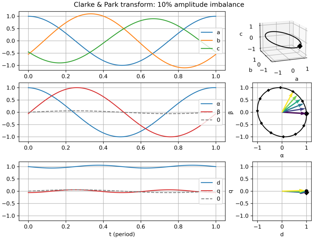
Unbalanced signal: slight amplitude differences across the three-phases → elliptical (slightly flattened circle) movement in the αβ plane → small −2ω fluctuations in the dq plane
Balanced signal, but with harmonics (2nd, 3rd, 5th or 7th) → the effect depends on the harmonics:
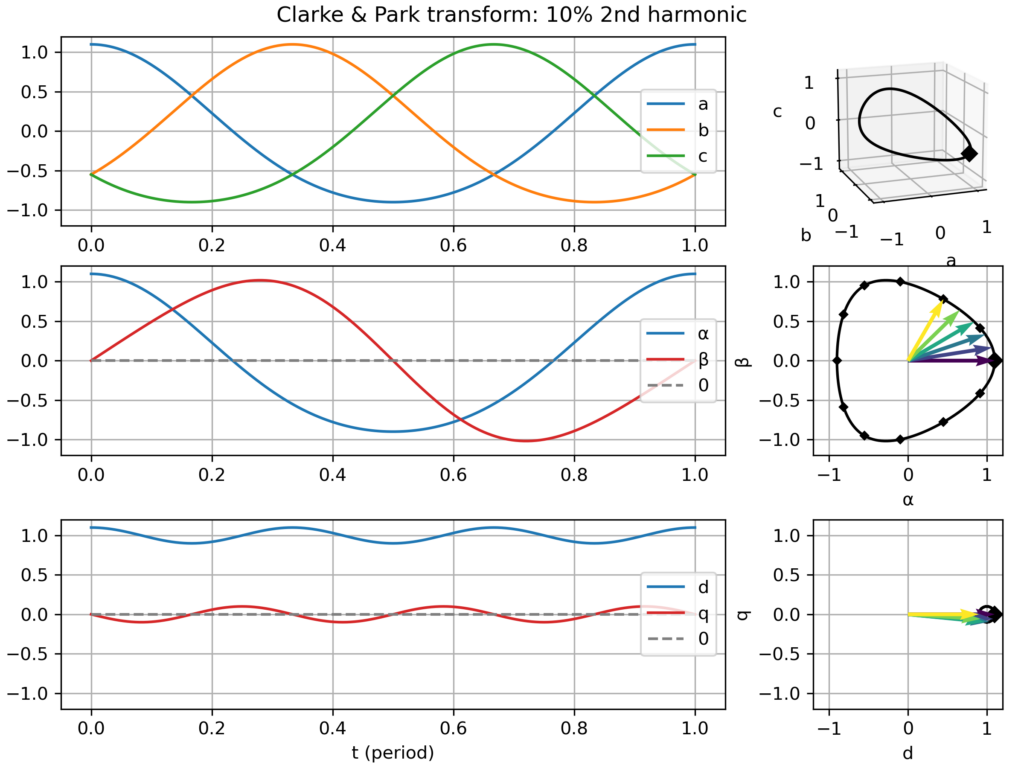
2nd harmonic → slightly triangular movement in the αβ plane → small −2ω fluctuations in the dq plane
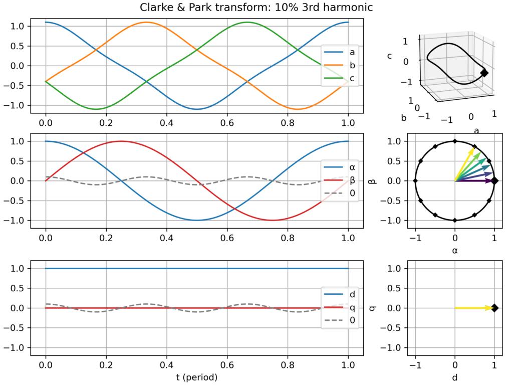
3rd harmonic: only create a 0-component (homopolar) → no effect in the αβ plane and in the dq plane
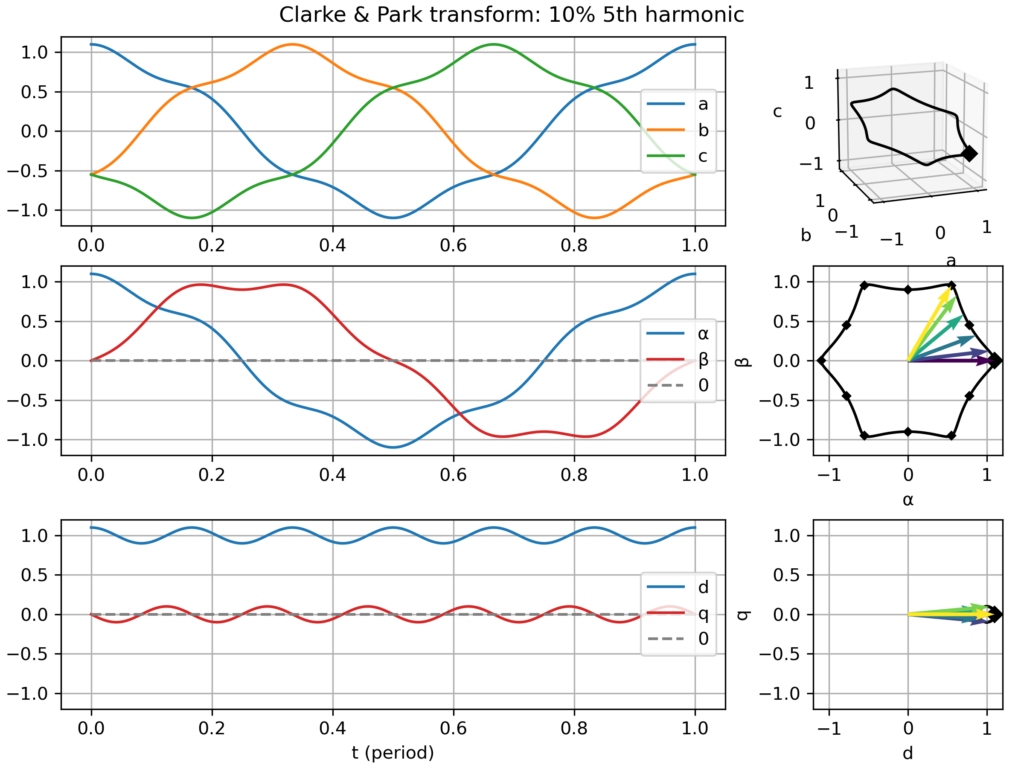
5th harmonic: slightly hexagonal movement in the αβ plane → small −6ω fluctuations in the dq plane
7th harmonic: slightly hexagonal movement in the αβ plane → small +6ω fluctuations in the dq plane
Explanation for the similar effect of the 5th and 7th harmonic: the former is negative sequence (−5ω) while the latter is positive sequence (+7ω), so from the point of view of the +1ω rotating dq frame, they all appear as 6ω fluctuations. However, this similarity only holds in absolute value, but in truth they are of opposite frequency.
Clarke & Park transform: balanced three-phase signalClarke & Park transform: balanced three-phase signal, but too slow dq frameClarke & Park transform: balanced three-phase signal, but too fast dq frameClarke & Park transform: balanced, but negative sequence, three-phase signalClarke & Park transform: slightly unbalanced signalClarke & Park transform: balanced signal with 2nd harmonic perturbationClarke & Park transform: balanced signal with 3rd harmonic perturbationClarke & Park transform: balanced signal with 5th harmonic perturbationClarke & Park transform: balanced signal with 7th harmonic perturbation
This week, I was trying to get a deep understanding of the necessary conditions for the appearance of contiguous periods ("long strokes") of negative prices in electricity spot markets. Such strokes appeared for example last weekend (5 Apr 2026).
For this study, I've created a toy economic dispatch, with as few parameters as possible. Indeed the goal is certainly not to recreate a complicated twin of the real power markets but instead only summon the simplest elements which are needed to cause the phenomenon.
My core assumption, waiting to be refuted, is that negative system prices can appear even when the marginal costs of all plants in the system are positive or zero. I suppose that inflexibility (e.g. block orders) should suffice. Is this indeed the case?
As of now, with only two power plants (base: cheap but inflexible and peak: flexible but expensive), the dispatch model can reproduce isolated negative marginal price events (see video capture), which occur at the single instant(s) supporting the curtailment of the base plant due to its inflexibility. However, this model cannot reproduce a sequence of consecutive negative price instants.
Adding free solar electricity makes up for more colorful graphs and generates long strokes of zero marginal price, but not strictly negative.
So my question/challenge is: what does it take to reproduce long strokes of negative prices?
A full-blown day-ahead power market model? Hopefully not!
Introducing binary (ON/OFF) decisions or other non-convexities? Perhaps, is it necessary to reproduce single negative price instants?
A larger, more diverse, fleet of power plants? Perhaps even a number as large the number of consecutive negative instants to be reproduced?
At the VéloMix hackathon at IMT Atlantique in Rennes, I met with Guillaume Le Gall (ESIR, Univ Rennes) and Matthieu Silard (IMT Atlantique) working on battery charging monitoring. We ended up working on the problem of State of Charge (SoC) estimation, that is evaluating the charge level of a battery by monitoring its voltage and current along time (and notably not its open circuit voltage).
I had heard SoC estimation was often performed by the Kalman filter (and in particular with EKF, its extended version), but I had never had the occasion to implement it. Time was too short to get it working on the day of the hackathon, but now I have drafted a Python implementation, or more precisely three implementations:
Step-by-step literate programming version of the filter, using a sequence of notebook cells, to implement one step of the filter → Nice to see the algorithm crunching the data line-by-line
Generic Kalman filter implementation (all the above steps wrapped in a single function, should work with any state space model)
Compact implementation specialized for SoC estimation with baked-in battery model (this last one should be the most useful to project, ready to convert to Arduino/C++ code)
All these are available in a single Jupyter notebook:
These last weeks, I’ve read William S. Cleveland book “The Elements of Graphing Data”.
I had heard it’s a classical essay on data visualization.
Of course, on some aspects, the book shows its age (first published in 1985), for example
in the seemingly exceptional use of color on graphs.
Still, most ideas are still relevant and I enjoyed the reading.
Some proposed tools have become rather common, like loess curves.
Others, like the many charts he proposes to compare data distributions (beyond the common histogram),
are not so widespread but nevertheless interesting.
One of the proposed tools I wanted to try is the (Cleveland) dot plot.
It is advertised as a replacement of pie charts and (stacked) bar charts, but with a greater visualization power.
Cleveland conducted scientific experiments to assess that superiority, but it’s not detailed in the book (perhaps it is in the Cleveland & McGill 1984 paper).
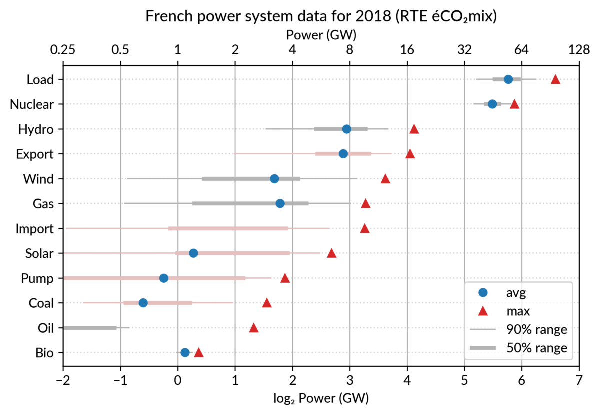
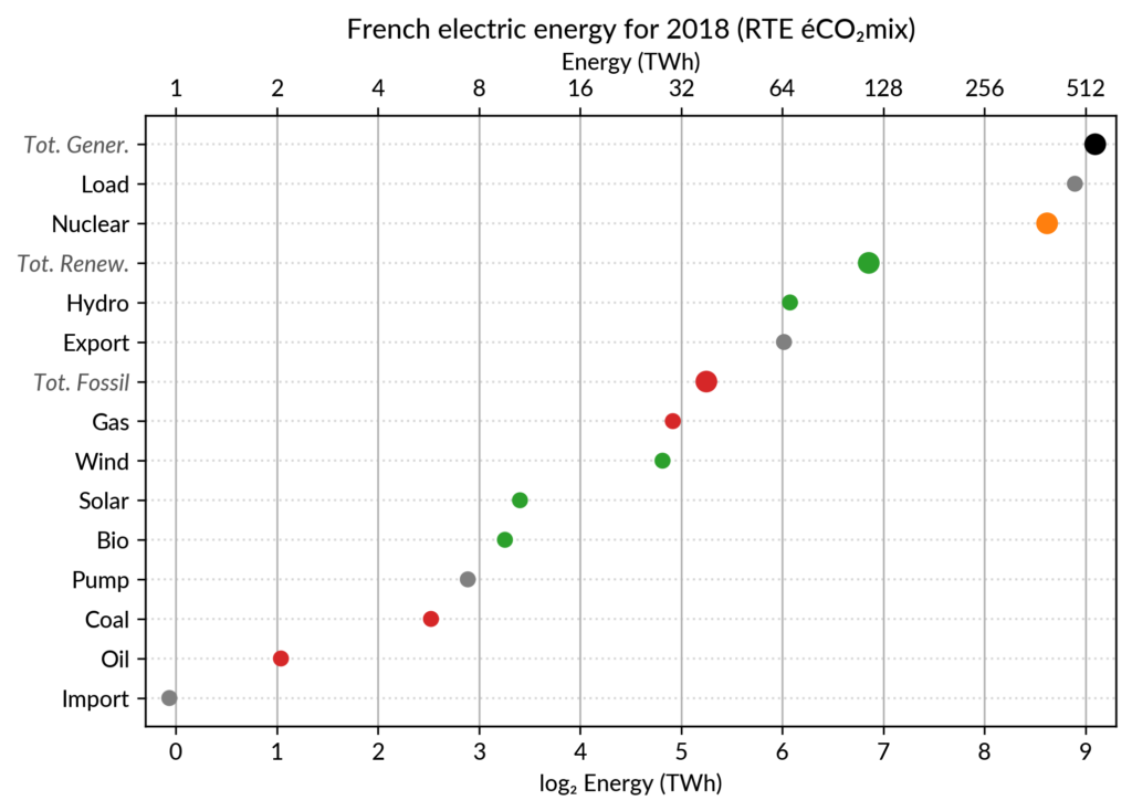
I’ve explored the visualization power of dot plots using the French electricity data from RTE éCO₂mix (RTE is the operator of the French transmission grid).
I’ve aggregated the hourly data to get yearly statistics similar to RTE’s yearly statistical report on electricity (« Bilan Électrique »).
The case for dot plot
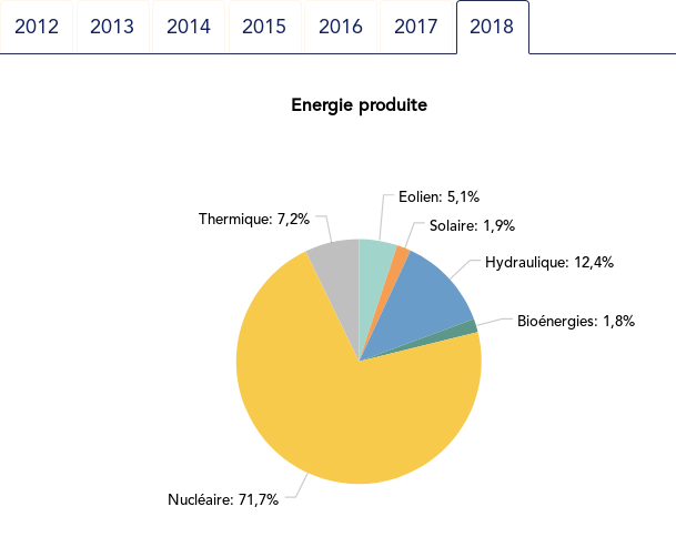
Such yearly energy data is typically represented with pie charts to show the share of each category of power plants. This is RTE’s pie chart for 2018 (from the Production chapter):
However, Cleveland claims that the dot plot alternative enables more efficient reading of single point values
and also easier comparison of different points together. Here is the same data shown with a simple dot plot:
I’ve colored plant types by three general categories:
Fossil (gas, oil and coal) in red
Renewable (hydro, wind, solar and bioenergy) in green
Nuclear in orange
Subtotals for each category are included.
Gray points are either not a production (load, exports, pumped hydro) or cannot be categorized (imports).
Compared to the pie chart, we benefit from the ability to read the absolute values rather than just the shares.
However, how to read those shares?
This is where the log₂ scale, also promoted by Cleveland in his book, comes into play. It serves two goals. First, like any log scale, it avoids the unreadable clustering of points around zero
when plotting values with different orders of magnitude.
However, Cleveland specifically advocates log₂ rather than the more
common log₁₀ when the difference in orders of magnitude is small (here
less than 3, with 1 to 500 TWh) because it would yield a too small
number of tick marks (1, 10, 100, 1000 here) and also because log₂ aids reading ratios of two values:
a distance of 1 in log₂ scale is a 50% ratio
a distance of 2 in log₂ scale is a 25% ratio
…
Still, I guess I’m not the only one unfamiliar with this scale, so I made myself a small conversion table:
Δlog
ratio a/b (%)
ratio b/a
0.5
71% (~2/3 to 3/4)
1.4
1
50% (1/2)
2
1.5
35% (~1/3)
2.8
2
25% (1/4)
4
3
12%
8
4
6%
16
5
3%
32
6
1.5%
64
As an example, Wind power (~28 TWh) is at distance 2 in log scale of
the Renewable Total, so it is about 25%. Hydro is distant by less than
1, so ~60%, while Solar and Bioenergies are at about 3.5 so ~8% each.
Of course, the log scale blurs the precise value of large
shares. In particular, Nuclear (distant by 0.5 to the total generation)
can be read to be somewhere between 65% and 80% of the total, while the
exact share is 71.2%. The pie chart may seem more precise since
the Nuclear part is clearly slightly less than 3/4 of the disc.
However, Cleveland warns us that the angles 90°, 180° and 270° are
special easy-to-read anchor values whereas most other values are in fact
difficult to read.
For example, how would I estimate the share of Solar in the pie chart
without the “1.9%” annotation? On the log₂ scaled dot plot, only a
little bit of grid line counting is necessary to estimate the distance
between Solar and Total Generation to be ~5.5, so indeed about 2% (with
the help of the conversion table…).
The bar chart alternative?
Along with the pie chart, the other classical competitor to dot plots is the bar chart.
It’s actually a stronger competitor since it avoids the pitfall of the poorly readable angles of the pie chart.
I (with much help from Cleveland) see three arguments for favoring dots over bars.
The weakest one may be that dots create less visual clutter. However, I see a counter-argument that bars are more familiar to most viewers, so if it were only for this, I may still prefer using bars.
The second argument is that the length of the bars would be meaningless.
This argument only applies when there is no absolute meaning for the
common “root” of the bars. This is the case here with the log scale. It
would also be the case with a linear scale if, for some reason, the zero
is not included.
The third argument is an extension of the first one (better clarity) in the case when several data points for each category must be compared. Using bars there are two options:
drawing bars side by side: yields poor readability
stacking bars on top of each other (if the addition makes
sense like votes in an election): makes a loss of the common ground,
except for the bottom most bars (of left most bars when using the
horizontal layout like here)
This brings me to the case where dot plots shine most: multiway dot plots.
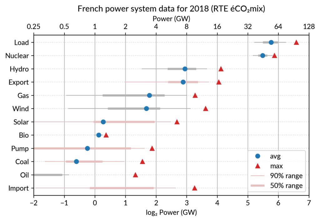
Multiway dot plots
The compactness of the “dot” plotting symbol (regardless of the
actual shape: disc, square, triangle…) compared to bars allows
superposing several data points for each category.
Cleveland presents multiway dot plots mostly by stacking horizontally
several simple dot plots. However, now that digital media allows high
quality colorful graphics, I think that superposition on a single plot
is better in many cases.
For the electricity data, I plot for each plant category:
the maximum power over the year (GW): red triangles
the average power over the year (GW): blue discs
The maximum power is interesting as a proxy to the power capacity.
The average power is simply the previously shown yearly energy production data, divided by the duration of the year.
The benefit of using the average power is that it can be superimposed
on the plot with the power capacity since it has the same unit.
Also, the ratio of the two is the capacity factor of the plant category, which is a third interesting information.
Since it is recommended to sort the categories by value (to ease comparisons), there are two possible plots:
plot sorted by the maximum powers (~capacity)
plot sorted by the average powers (equivalent to the cumulated energy for the year)
The two types of sorts are slightly different (e.g. switch of Wind and Gas) and I don’t know if one is preferable.
Adding some quantiles
Since I felt the superposition of the max and average data was
leaving enough space, I packed 4 more numbers by adding gray lines
showing the 90% and 50% range of the power distribution over the year.
With these lines, the chart starts looking like a box plot, albeit pretty non-standard.
However, I faced one issue with the quantiles: some plant categories
are shut down (i.e. power ≤ 0) for a significant fraction of the year:
Solar: 52% (that is at night)
Coal: 29% in 2018
Import: 96% (meaning that the French grid was net-importing electricity from its neighbors only 4% of the year in 2018)
To avoid having several quantiles clustered at zero, I chose to
compute them only for the running hours (when >0). To warn the
viewer, I drew those peculiar quantiles in light red rather than gray.
Spending a bit more time, it would be possible to stack on the right a
second dot plot showing just the shutdown times to make this more
understandable.
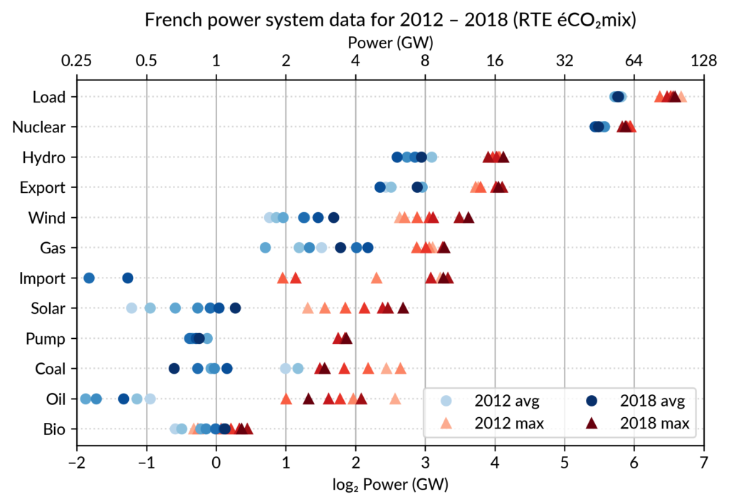
Animated dot plots
Again trying to pack more data on the same chart, I superimposed the statistics for several years.
RTE’s data is available from 2012 to 2018 (2019 is still in the making…) and the year can be encoded by the lightness of the dots.
I think it is possible to perceive interesting information from this
chart (like the rise of Solar and Wind along the drop of Coal), but it
may be a bit too crowded.
With only two or three years (e.g. 2012-2015- 2018), it is fine though.
A better alternative may be to use an animation. I tried two solutions:
GIF animation generated from the sequence of plots for each year
Interactive plot with the highlight of each year with mouse interaction using Altair
GIF animation
To assemble a set of PNG images (Dotplot_2012.png to Dotplot_2018.png) into a GIF animation,
I used the following “incantation” of ImageMagick:
The -delay 30 option sets a frame duration of 30/100 seconds, so about 3 images/s.
The result is nice but it is not possible to pause on a given year for a closer inspection.
Using a video file format instead of GIF, pausing would be possible, but a convenient way
to browse through the years would be much better.
Interactive dot plots with Altair/Vega
For a true interactive plot, I’ve played with Altair, the Python package based on the Vega/Vega-Lite JavaScript libraries.
It’s the second or third time I experiment with this library
(all the other plots are made with Matplotlib).
I find Altair appealing for its declarative programming interface
and the fact it is based on a sound visualization grammar. For example, it is based on a well-defined notion of visual encoding channels: position, color, shape…
For the present task, I wanted to explore more particularly the declarative description of interactivity, a feature added in late 2017/early 2018 with the release of Vega-Lite 2.0/Altair 2.0.
Here is the result, illustrated by a screencast video before I get to know
how to embed a Vega-Lite chart in WordPress:
Here fields=['year'] means that hovering one point will automatically select
all the data samples having the same year.
Then, the selection object is to be appended to one or several charts
(so that the selection works seamlessly across charts).
This is no more than calling .add_selection(selector) on each chart.
Finally, the selection is used to conditionally set the color of plotting marks,
or whatever visual encoding channel we may want to modify (size, opacity…).
A condition
takes a reference to the selection and two values: one for the selected case, the second when unselected.
Here is, for example, the complete specification of the bottom chart which
serves as a year selector:
years = base.mark_point(filled=True, size=100).encode(
    x='year:O',
    color=alt.condition(selector,
                        alt.value('green'),
                        alt.value('lightgray')),
).add_selection(selector)
The Vega-Lite compiler takes care of setting up all the input handling logic to make the interaction happen.
A few days ago, I happen to read a Matlab blog post on creating a linked selection
which operates across two scatter plots. As written in that post,
“there’s a bit of setup required to link charts like this, but it really
isn’t hard once you’ve learned the tricks”.
This highlights that the back-office work of the Vega-Lite compiler is
really admirable.
Notice that doing it in Python with Matplotlib would be equally verbose,
because it is not a matter of programming language but of imperative versus declarative plotting libraries.
Notes
Other discussions on dot plots
Here are the few other pages I found on Cleveland’s dot plots,
one with Tableau and one with R/ggplot:
I created the plots using RTE éCO₂mix
hourly records to generate the yearly statistics.
For a unknown reason, when I sum the powers over the year 2018,
I get slightly different values compared to RTE’s official 2018 statistical report on electricity (« Bilan Électrique 2018 »).
For example: Load 478 TWh vs 475.5 TWh, Wind 27.8 TWh vs 28.1 TWh…
I don’t like having such unexplained differences,
but at least they are small enough to be almost invisible in the plots.
Now that I'm back from SGE 2018 conference, I've put online the manuscript of my article and the slides of my presentation (in French).
“Gestion d'énergie avec entrées incertaines :
quel algorithme choisir ?
Benchmark open source sur une maison solaire”
The title in English (translation of the whole article in progress...) is:
“Energy management with uncertain inputs:
which algorithms ?
Open source benchmark based on a solar home”
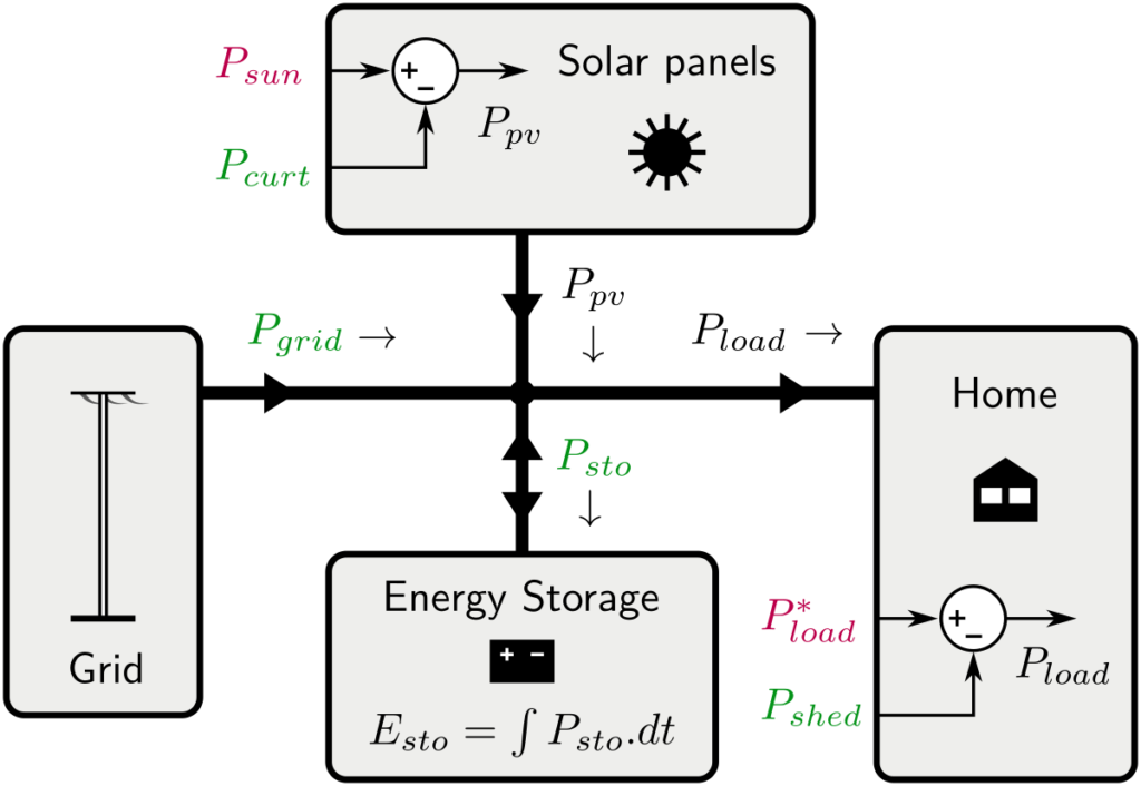
Here is the model of the solar home (power flows)
I've also a first translation of the abstract:
“Optimal management of energy systems requires strategies based on optimization algorithms. The range of tools is wide, and each tool calls on various theories (convex, dynamic, stochastic optimization...) which each require a period of appropriation ranging from a few days to several months.
It is therefore difficult for the novice energy management practitioner to understand the main characteristics of each approach so we can compare them objectively and finally find the method or methods best suited to a given problem.
To facilitate an objective and transparent comparison, we propose an exemplary and simple energy management problem: a solar house with photovoltaic production and storage. After justifying the sizing of the system, we illustrate the benchmark by a first comparison of some energy management methods (heuristic rule, MPC and anticipatory optimization). In particular, we highlight the effect of the uncertainty of solar production on performance.
This benchmark, including the management methods described, is open source, accessible online and multi-language (Python, Julia and Matlab).”
As of now, only rather simple energy management methods are implemented, but I'd like to add some kind of stochastic MPC (once I've clarified what this really means), and later Stochastic Dynamic Programming.
I've started exploring an open dataset that should be very useful for research on residential solar energy (for example studying energy self-consumption with a PV-battery system).
My Python code to manipulate this dataset and some preliminary studies (simple statistics) is freely available on Github: https://github.com/pierre-haessig/ausgrid-solar-data. This data exploration code is extensively using pandas (for slicing, grouping, resampling, etc.).
The “Solar home electricity dataset” is made available by Ausgrid, an Australian electric utility which operates the distribution grid in Sidney and nearby areas.
This dataset contains a pretty rich record:
electricity consumption and the PV production
of 300 customers (in Sidney and its area),
over three years (July 2010 to June 2013),
with a 30 minutes timestep.
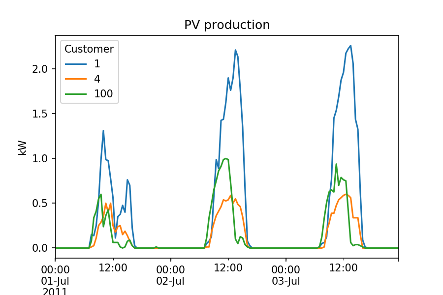
Here is a small extract of the PV production for 3 randomly chosen customers, over 3 days in July 2011:
Many more plots and statistics are given in the Jupyter notebooks available on the Github repository.
Locating postcodes (geocoding)
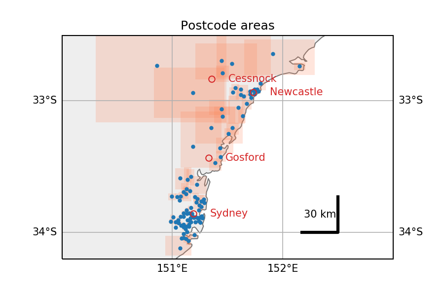
Also, the exploration of this dataset was an occasion to discover the Google Maps Geocoding API. Indeed, the location of each anonymous customer is given by a postcode only. To enable quantitative study of the spatiotemporal pattern in PV production, I've tried to locate this postcodes. The Python code for this is in the Postcodes location.ipynb Notebook. Map plotting is done with cartopy.
Extracted from this notebook, here is an overview of the locations of the postcodes present in the dataset (in Australia, NSW). Red rectangles are the boundaries of each postcode, as returned by Google maps (small in urban areas along the coast, gigantic otherwise).
2019-11-11 update: fixing broken link to dataset webpage on Ausgrid website.
To answer the repeating need to share advice on how to get an efficient Python setup for scientific computing and data analysis, I've created a dedicated page: Python setup for scientific computing.
I've started to play with the pretty nice Cozir CO2 sensor from GSS. This relates to research projects on air quality control.
For testing purpose, the sensor is connected to my computer through a USB-serial converter cable. In order to communicate with the sensor (e.g. grab the CO2 concentration data), I've written a bit of Python code to wrap the low-level ASCII communication protocol into a higher level, more compact API.
For example, instead of exchanging byte codes, reading the temperature becomes:
>>> from cozir import Cozir
>>> c = Cozir('/dev/ttyUSB0')
>>> c.read_temperature()
20.5
Documents from the short seminar "Python for Control & Signal" are now online. These include two IPython Notebooks: IIR filter design and Linear Quadratic control. These two applications give a special focus to the following packages: scipy.signal and SymPy.
I just put online the material of my Python training class I taught yesterday for the first time to a group of ~15 science teachers at my school ENS Rennes. It is a new requirement of the French Education Ministry that these teachers (in Math, Physics and Engineering) will have to teach Programming and Numerical computing with Python, starting next academic year in September 2013. They can otherwise choose Scilab, which can be useful for playing with block diagrams.
Since the targeted audience was mainly composed of Mechanical Engineering teachers, I tried to anchor several examples in that field. Nothing "advanced" though, because I'm not a mechanical engineer ! And more importantly, those examples were meant to be ready-to-use, for teachers to be soon in front of their new students. I hope they found this useful !

 Extracted from this notebook, here is an overview of the locations of the postcodes present in the dataset (in Australia, NSW). Red rectangles are the boundaries of each postcode, as returned by Google maps (small in urban areas along the coast, gigantic otherwise).
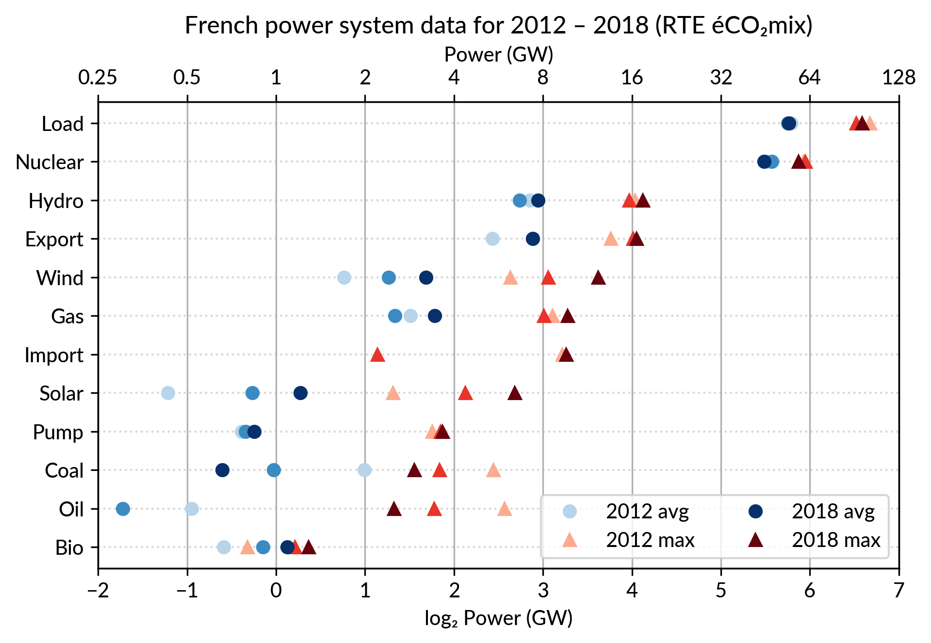