I recently updated an old Python script which I created to visualize the Clarke (αβ) & Park (dq) transformations applied to three-phase signals (voltages or currents). These geometric transforms are at the core of most control approaches for AC motors and grid-connected converters. This work is now publicly available as a Python Jupyter notebook (links below).
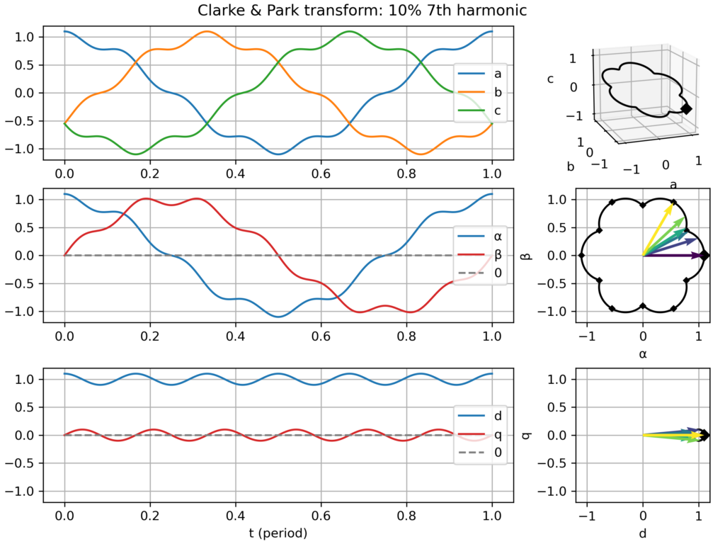
The goal is to “look beyond the math” (beyond the matrices-based definitions) to witness how the different transformations relate to each other (i.e. Park = Clarke + Rotation(−ω.t)) and how different signals get transformed. The plot I created assembles:
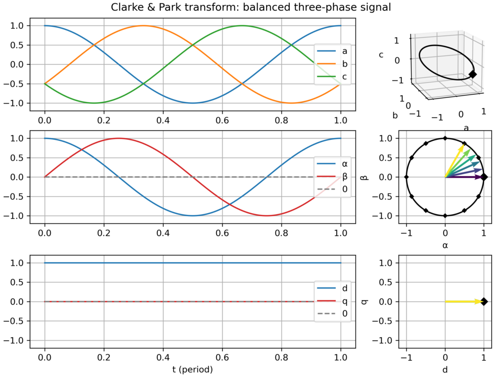
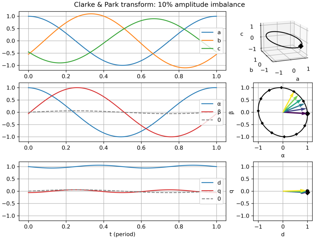
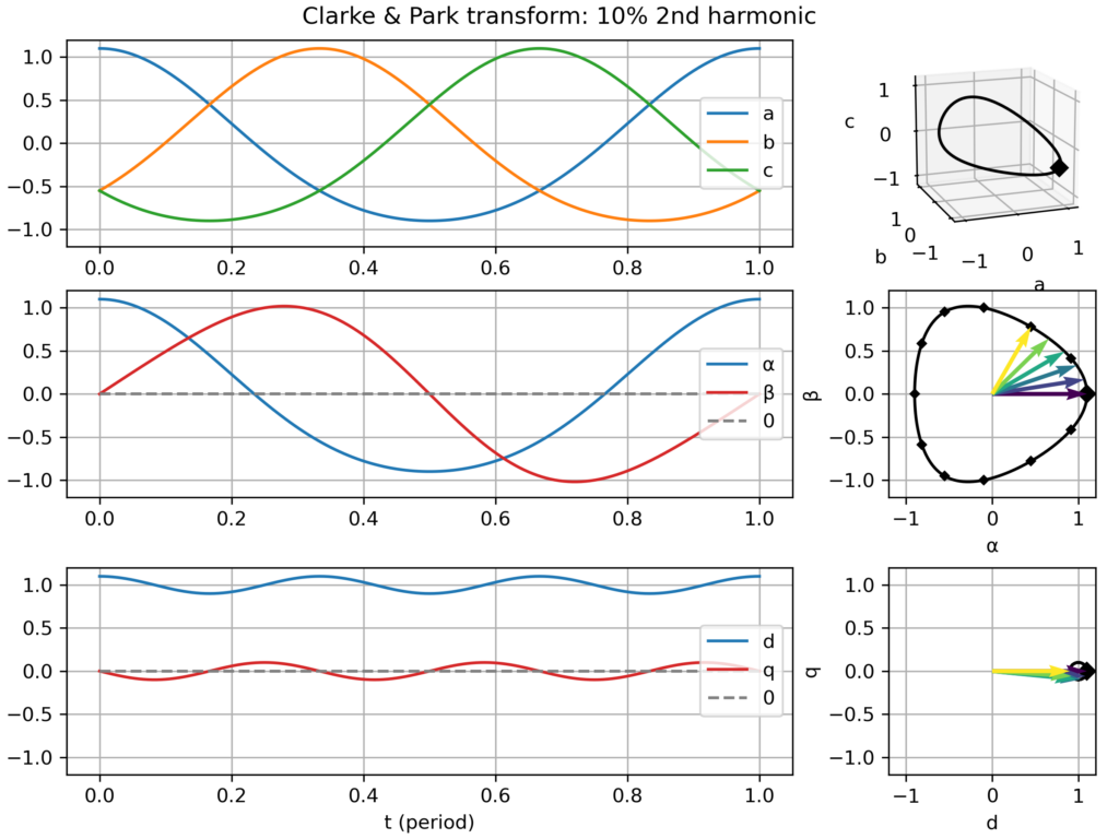
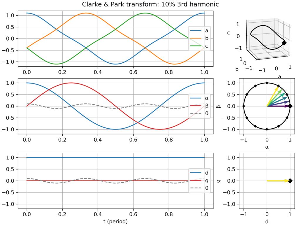
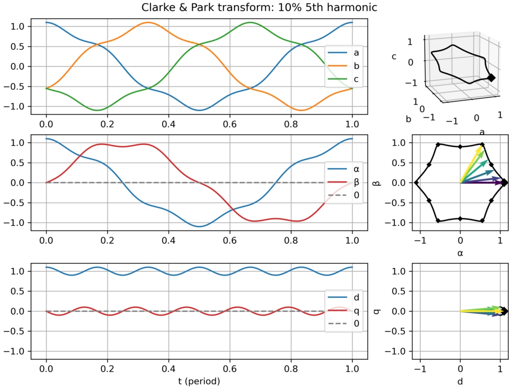
time domain plots in the natural (abc), Clarke (αβ) & Park (dq) frames over one electric period
a corresponding plot in the space vector domain (i.e. parametric curve), either in the hard-to-see 3D abc frame, and in the much clearer Clarke (αβ) & Park (dq) frames, where nice 2D geometric figures appear (only a "boring circle" for a balanced three-phase signal, but nice snowflake-like patterns appear with 5th or 7th harmonics!)
Transforms gallery
In particular, I saved a series of plots for the following cases:
Balanced three-phase signal
nominal case: speed of the dq frame perfectly matching the signal frequency → perfect circular movement in the αβ plane and static vector in the dq plane
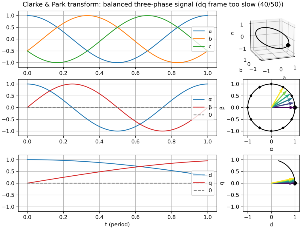
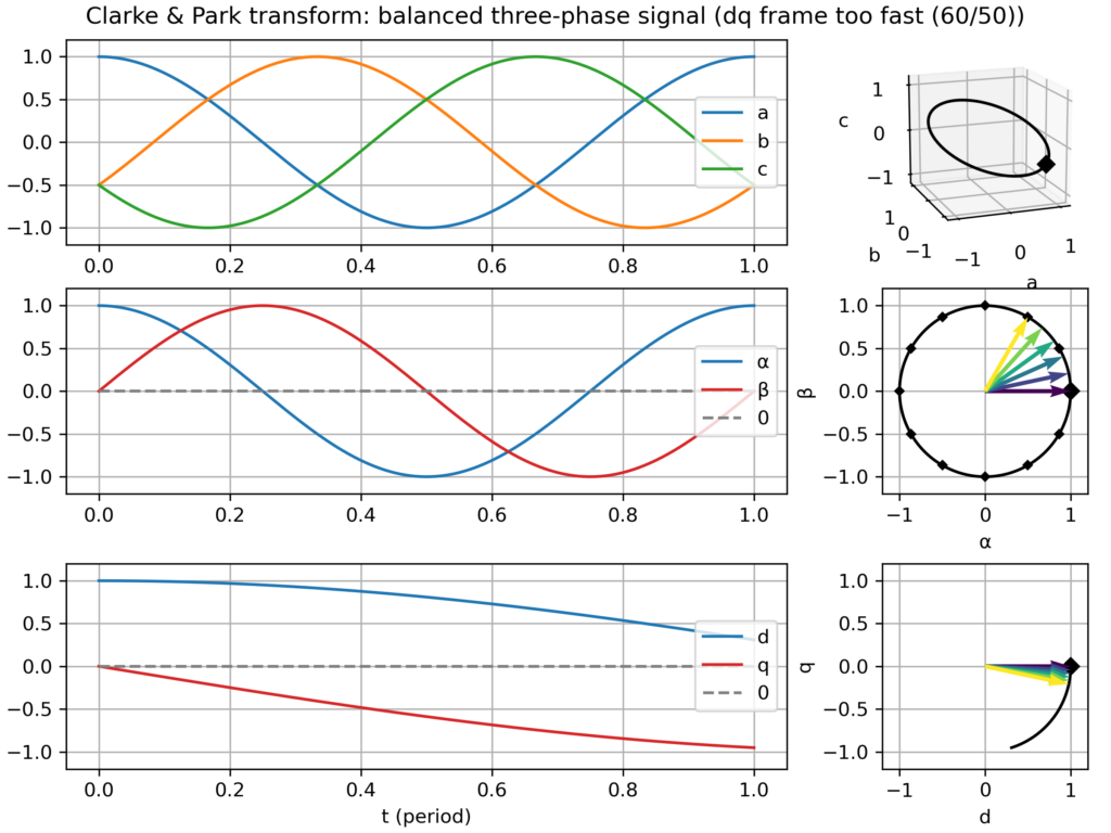
dq frame slightly too slow or too fast → slowly varying vector in the dq plane
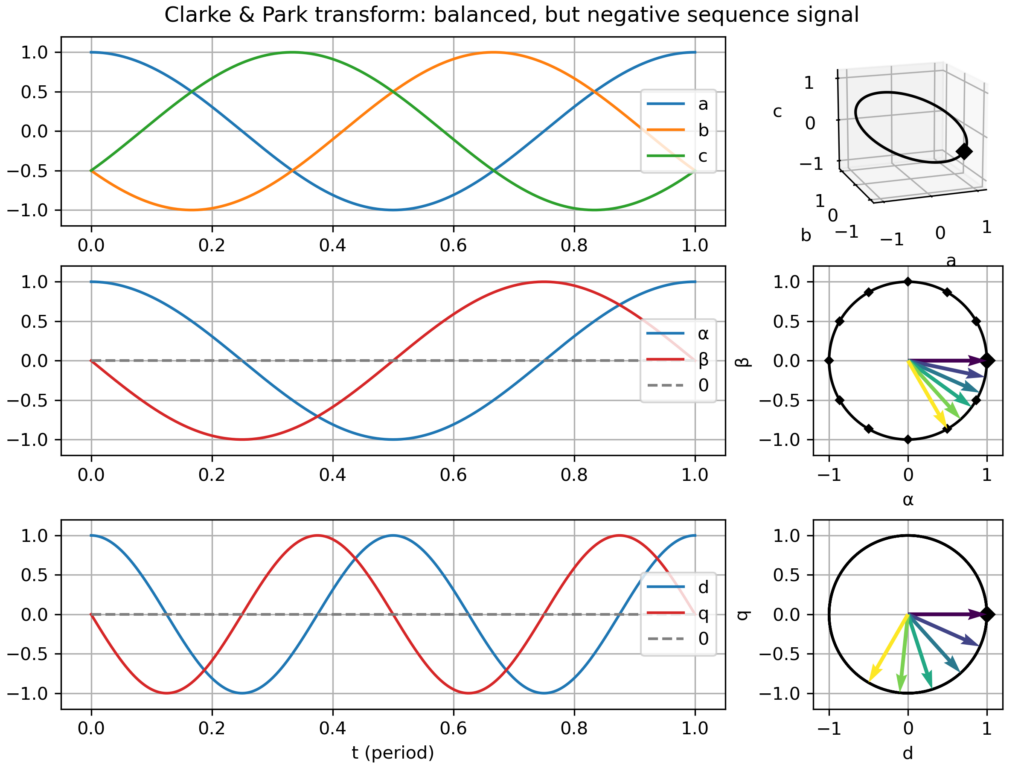
negative sequence signal (i.e. negative frequency −ω) → fast varying vector in the dq plane (−2ω apparent frequency)
Unbalanced signal: slight amplitude differences across the three-phases → elliptical (slightly flattened circle) movement in the αβ plane → small −2ω fluctuations in the dq plane
Balanced signal, but with harmonics (2nd, 3rd, 5th or 7th) → the effect depends on the harmonics:
2nd harmonic → slightly triangular movement in the αβ plane → small −2ω fluctuations in the dq plane
3rd harmonic: only create a 0-component (homopolar) → no effect in the αβ plane and in the dq plane
5th harmonic: slightly hexagonal movement in the αβ plane → small −6ω fluctuations in the dq plane
7th harmonic: slightly hexagonal movement in the αβ plane → small +6ω fluctuations in the dq plane
Explanation for the similar effect of the 5th and 7th harmonic: the former is negative sequence (−5ω) while the latter is positive sequence (+7ω), so from the point of view of the +1ω rotating dq frame, they all appear as 6ω fluctuations. However, this similarity only holds in absolute value, but in truth they are of opposite frequency.
Clarke & Park transform: balanced three-phase signalClarke & Park transform: balanced three-phase signal, but too slow dq frameClarke & Park transform: balanced three-phase signal, but too fast dq frameClarke & Park transform: balanced, but negative sequence, three-phase signalClarke & Park transform: slightly unbalanced signalClarke & Park transform: balanced signal with 2nd harmonic perturbationClarke & Park transform: balanced signal with 3rd harmonic perturbationClarke & Park transform: balanced signal with 5th harmonic perturbationClarke & Park transform: balanced signal with 7th harmonic perturbation
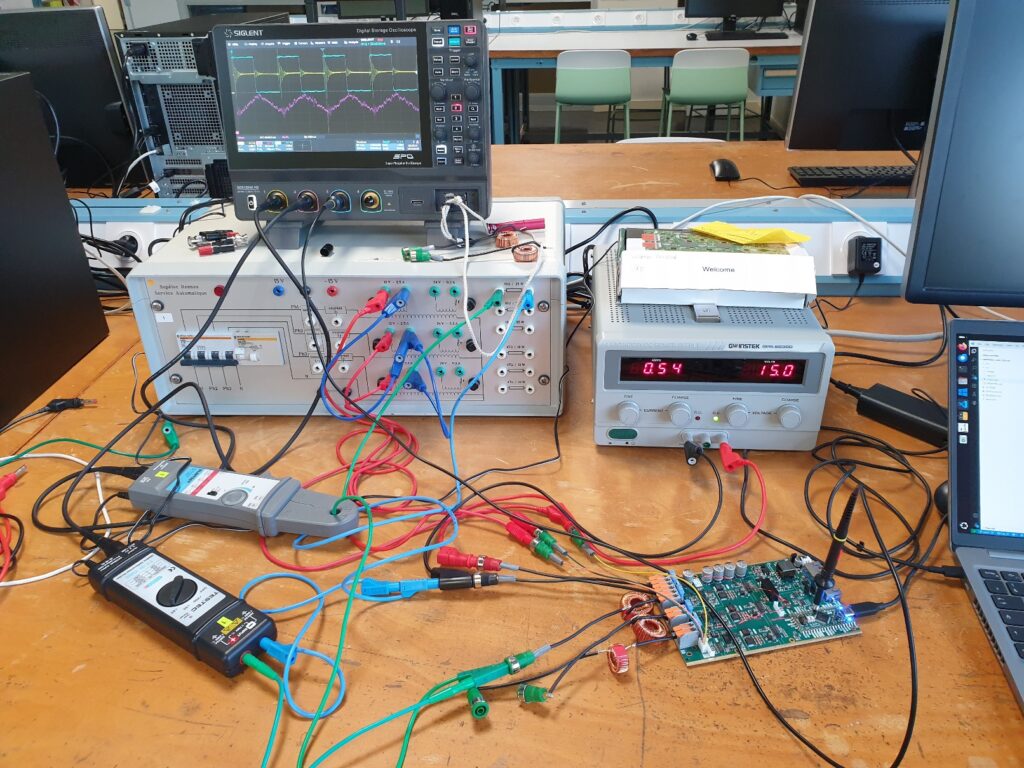
Les vacances scolaires d'avril ont été l'occasion d'accueillir des collègues profs de prépa de toute la France pour faire des manips d'électronique de puissance avec les cartes OwnTech du campus de Rennes de CentraleSupélec.
Même si en une journée nous ne sommes pas allés au bout du programme prévu initialement (du hacheur jusqu'à l'onduleur connecté au réseau, c'était un peu gourmand), on s'en est approché via les transformées de Clarke & Park (cf. post dédié).
Série de TP du cursus ingénieur : http://éole.net/courses/onduleur/ (Cursus Ingénieur CentraleSupélec, spécialité Génie Électrique, Énergie & Systèmes. 1A)
This week, I was trying to get a deep understanding of the necessary conditions for the appearance of contiguous periods ("long strokes") of negative prices in electricity spot markets. Such strokes appeared for example last weekend (5 Apr 2026).
For this study, I've created a toy economic dispatch, with as few parameters as possible. Indeed the goal is certainly not to recreate a complicated twin of the real power markets but instead only summon the simplest elements which are needed to cause the phenomenon.
My core assumption, waiting to be refuted, is that negative system prices can appear even when the marginal costs of all plants in the system are positive or zero. I suppose that inflexibility (e.g. block orders) should suffice. Is this indeed the case?
As of now, with only two power plants (base: cheap but inflexible and peak: flexible but expensive), the dispatch model can reproduce isolated negative marginal price events (see video capture), which occur at the single instant(s) supporting the curtailment of the base plant due to its inflexibility. However, this model cannot reproduce a sequence of consecutive negative price instants.
Adding free solar electricity makes up for more colorful graphs and generates long strokes of zero marginal price, but not strictly negative.
So my question/challenge is: what does it take to reproduce long strokes of negative prices?
A full-blown day-ahead power market model? Hopefully not!
Introducing binary (ON/OFF) decisions or other non-convexities? Perhaps, is it necessary to reproduce single negative price instants?
A larger, more diverse, fleet of power plants? Perhaps even a number as large the number of consecutive negative instants to be reproduced?
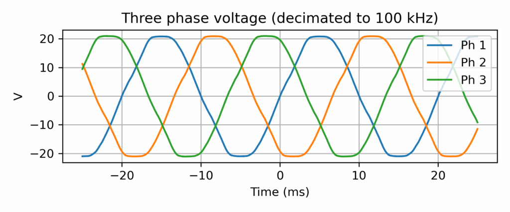
Open question: how specific to Rennes campus is the grid voltage shape?
Three-phase grid voltage record (output of a 15Vrms transformer) at CentraleSupélec, Rennes campus
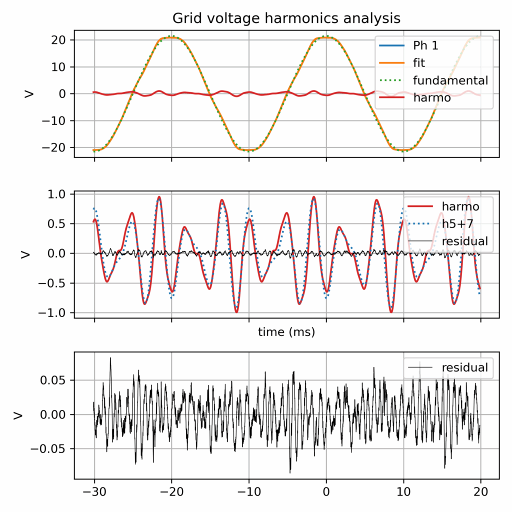
Grid voltage harmonics analysis
More grid voltage records data (by RTE)
That being said, after a tiny data survey, I found that RTE made available last year a dataset of 12053 records of grid records (specifically grid fault events), i.e. a much richer database! https://github.com/rte-france/digital-fault-recording-database
Context: grid connected inverter
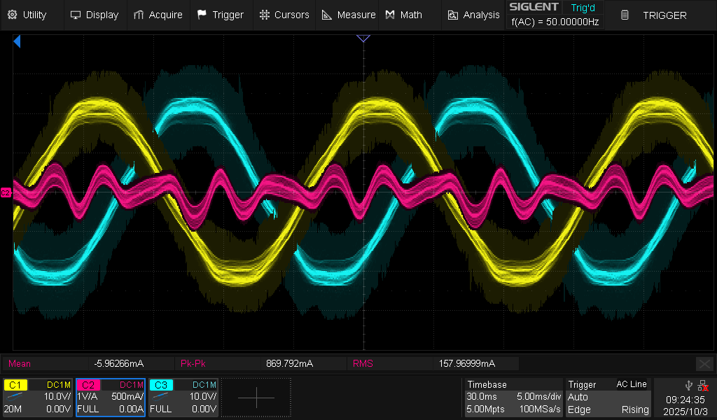
This was created in the context of another investigation: the harmonic current perturbation in a grid connected inverter. And in the end: the harmonic current looks indeed proportional to the harmonic voltage, so the grid imperfection (albeit perfectly within compliance standards) is the likely cause (along with the simplistic inverter control which make no effort to reject harmonics)...
Oscilloscope record of harmonic current perturbation in a grid connected inverter (grid following current control, with current set point equal to 0.0 A)
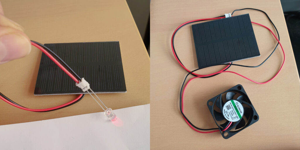
[In French] I've uploaded the documents I used last month for a one-hour lecture at a primary schools (7-8 year old children), with a theoretical part on electrical energy conversion and a pratical part with small PV panels.
This post is meant to help people in search of a refurbished notebook. Indeed, it’s easy to get lost in the processors references (“how does an Intel Core i5-8250U compares to an i5-10210U?” Spoiler: they are almost the same!). It is the outcome of me researching whether it is worth replacing my Lenovo Thinkpad T470 notebook, a 2017 model bought 2nd hand in 2020. While the conclusion is that I’ll probably wait a bit more, this was a nice data research about the evolution of the computing power of office notebooks over the last decade.
In this post, I focus on key results while the full dataset and associated Python code is available in the GitHub repository https://github.com/pierre-haessig/notebook-cpu-performance/. Also, there is a CPUs table, with characteristics and performance scores hosted on Baserow. Testing this so-called “no-code” cloud database was an additional excuse for this project... While I don’t want to comment my experience here, I’ll just say I found it a neat alternative to spreadsheets for doing database-style work (e.g. creating links between tables).
Dataset description
About the scores: I’ve extracted computing performance scores from the Geekbench 6 data browser https://browser.geekbench.com/ which conveniently make their database public (in exchange of Geekbench users automatically contributing to the database for free). This test provides two scores:
Single-Core score is useful to assess the execution speed of one application (webmail, text editor, spreadsheet...)
Multi-Core score is geared towards multitasking (or some computations which can exploit all processor cores like video encoding, I believe).
Geekbench explains that these scores are proportional to the processing speed, so a score which is twice as large means a processor that is twice as fast, that is a computing task completed in half the time, if I got it right.
About the processors selection: I’ve extracted the scores for CPUs found in typical refurbished office notebooks, that is midrange & low power CPUs, aka Intel Core i5 processors, from the so-called U series, but also corresponding AMD Ryzen 5. The earliest model is the Intel Core i5-5200U launched in 2015, while the most recent is the Intel Core Ultra 125U/135U from late 2023 (there wasn’t enough data for the 2024 Intel Core Ultra 2xx models). Notice that there are no refurbished notebooks of 2023 yet on the market, so there is some amount of guessing on what will be the "typical office notebook CPUs" of 2023-2025.
CPU performance charts
Enough speaking, here are two graphs of processor performance.
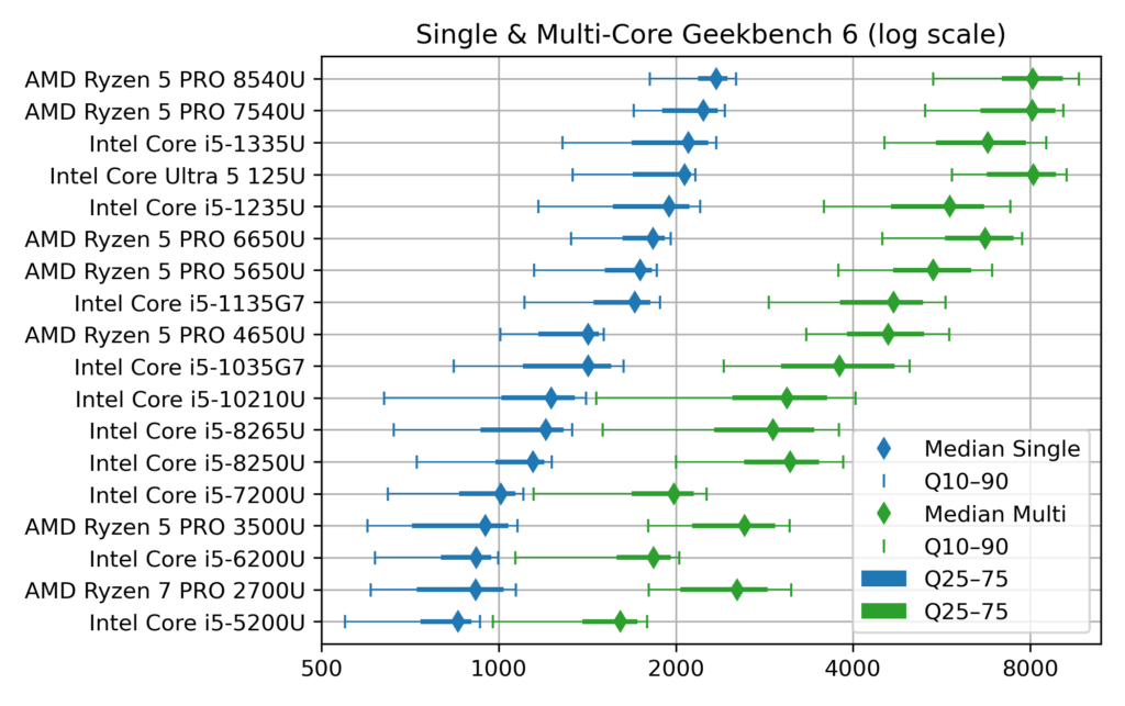
1) Ranked CPU performance
First a dot plot/boxplot chart showing CPU performance, ranked by Single-Core performance (which is close, but not quite, the same as the Multi-Core rank):
Chart of Geekbench CPU performance of typical office notebooks
The horizontal scale for the score is logarithmic, so that each vertical grid line means a difference by a factor 2. This allows superimposing Single-Core (blue) and Multi-Core (green) data.
The diamonds are the median scores, while the lines show the variability. Indeed, there is no unique value for each CPU, due to the many factors which can affect computing performance: temperature, power source (battery vs. AC adapter) and energy saving policy (max performance vs. max battery life). To account for this, I’ve collected about 1000 samples for each CPU and summarized them by computing quantiles. The thick lines show the quantiles 25%–75% (also called interquartile range, which contains half the samples) while the thin line ended by mustaches shows the quantiles 10%–90% (the most extreme deciles which contain 80% of the samples).
Notice that to avoid data overcrowding, this the “short” version of the chart where I picked one CPU model per generation, while there are typically two (like i5-1135 and i5-1145, with very close performance). The full chart variant (twice as long) can be found in the chart repository, along with the variants sorted by Multi-Core score.
2) CPU performance over time, with trend
The second chart shows the evolution of CPU performance over time. Only the median score is shown here, to avoid overcrowding the graph, but with all the CPU models of the dataset. This graph is interactive (perhaps a mouse is required, though): hovering each point reveals the processor name and details like the number of cores.
[EDIT: for some unknown reason, the tooltip which is suppose to appear when hovering points has an erratic display (pops up a large blank rectangle). In the mean time, I've put the charts on a dedicated page which works fine]
Vega viz of CPU performance over time, linear scale
The dot color and shape discriminate the CPU designer: Intel vs. AMD (the classical term “manufacturer” is not appropriate for AMD, neither for the latest Intel products). The gray dotted line shows the exponential trend, that is a constant-rate growth trends, in the spirit of Moore’s law (doubling every 2 years), albeit with a much smaller rate, see values below.
This second plot was done with Vega-Altair which is very nice for data exploration and interactivity. However, it is perhaps a bit less customizable than my “old & reliable” plotting companion, Matplotlib, used for the first chart. In particular, I didn’t manage to replicate to the nice log2 scale, created by manually setting the ticks position and label (see Retrieve_geekbench.ipynb notebook, “Log2 scale variant”), but could be achieved more cleanly with Matplotlib’s tick formatter. So here is the log2 variant of the performance over time chart, albeit with the raw log2 scores. With this scale, the exponential trend becomes a straight line.
Vega viz of CPU performance over time, log scale
How to read these raw log2 scores: values [0, 1, 2, 3] correspond to [1000, 2000, 4000, 8000], while the general formula is y = 1000 × 2x. Also, because there are grid lines for half scores (0.5→1000×√2 ≈ 1414), scores which are different by factor 2 are here separated by two grid lines instead of just one in the first plot.
Comments of CPU performance
What can be said from the charts above?
1) General trend
Sure, there has been some progress in CPU performance over the decade!
but the progress is faster for Multi-Core than Single-Core performance. In detail, the exponential trend fitting yields:
Single-core trend: +12% per year (±1%), or, said differently, a time to double the performance of about 6.25 years (±10 months)
Multi-core trend: +20%/y ±2%/y, or a time to double the performance of about 3.75 years (±4 months)
→ In both cases, the growth well slower than the 2 years (that is +41%/y) of Moore’s law.
2) Effect of increased core count
There is a clear effect of diminishing returns within the general trend to add more CPU cores:
From about 2010 until 2017 (ending with Intel 7th gen Core i5-7*00U), notebook CPUs shipped with 2 cores, with a Multi-Core score ending close to twice the Single-Core one (2000 vs 1000 for Intel Core i5-7300U)
From 2018 to 2021, notebook CPUs had 4 cores, but with Multi-Core to Single-Core scores ratio between 2.5 and 3.0 (at least for median scores)
Fast-forward to 2024, the most recent CPUS come with 6 (AMD) or even 10–12 cores (Intel, albeit with only 2 P[owerful] cores), and the Multi-Core score finally gets close to 4 times the Single-Core one (8000 vs. 2000 for Core Ultra 125U).
3) Off the trend
The exponential fits gives a false sense of a smooth progress in performance, while the true evolution is a bit more stepwise, with some processors “lagging behind” and others “ahead of their time”:
AMD CPUs before 2020 (Ryzen 7 PRO 2700U and Ryzen 5 PRO 3500U) are lagging behind their Intel counterpart, especially for Single-Core performance. Successors have closed the gap (notably with the Ryzen 5 PRO 5650U).
From 2018 to 2020, Intel has kept releasing “re-re-refreshed” versions of its 2017 Kaby Lake (7th gen) architecture, so that the difference between the Intel Core i5-8250U (mid 2017), i5-8265U (mid 2018) and i5-10310U (early 2020) is pretty thin.
Performance of Intel processors makes nice leaps with the 11th and 12th gen (Core i5 11*5G7 and 12*5U), but things get more mixed starting 2023 with the new branding of “Core Ultra” processors, which comes with more variants (V and U series in the 2nd gen). Time will tell how this evolves further.
4) About performance variability
Up to this point, I’ve only commented the median score, while deferring the discussion about performance variability shown on the first plot.
First things first: the performance variability of notebook CPUs is quite large, with almost a factor 2 between the top 10% and bottom 10% (90% and 10% quantiles)
The Single-Core score distribution is left-skewed, that is the median and top 10% scores are often close together, while most variability comes in the left tail of low scores. My interpretation is that the top score indicates the rated chip performance and the fact that the median is quite close means that about half the notebooks ride close to it. This means that it’s quite easy to experience this rated performance in practice. Still, the bottom half can get much slower, but perhaps these are cases where notebooks are running in a “low power/max battery life” setting. If that’s the case, it is not bad news, because notebook processors are designed to dynamically adjust their frequency & voltage to save energy.
This is why I always advise my students facing an unresponsive notebook to plug their AC adapter, especially when I make them run some microgrid optimization code.
Still, my father experienced a disappointingly low score of 1200 with its i5-1245U powered laptop (median score is 1950), while we took care to plug the AC adapter and set the power strategy to max performance.
The Multi-Core score distribution is, on the other hand, much more symmetric. I interpret this as meaning that it may be more difficult to reach the rated Multi-Core performance, at least with notebook CPUs. I guess that when all cores works simultaneously, the processor easily hits its maximum power or temperature limits, while one core working alone has much more to “express its talent”
What is left to be explored is the effect of notebook’s chassis. Seeing for example the pretty large variability of Intel Core i5-10210U, perhaps there exists clusters showing that the bottom performance comes from some models. Indeed, part of the power management of notebooks is under the control of the manufacturer. Question example: out of the Dell Latitude 5410 and the HP ProBook 440 G7 which both feature this CPU, is one better than the other?
Conclusion
Et voilà, I guess that’s enough for one post. Of course I only covered computing metrics. For example, when I said in the intro that Intel Core i5-10210U and i5-8250U are almost the same, these processors are still 2 years apart and the corresponding notebooks may come with different Wifi and Bluetooth connection standards, so that the more recent10210U may still be more interesting.
In a following post, I will write on the second part of this dataset: the notebook offers table, which links the system price to its CPU performance, to get Pareto-style trade-off chart of price vs. performance. Notice that this dataset and the draft plotting code are already available in the repository (Offers_plot.ipynb notebook and Baserow Notebook offers table).
This is a test post to see how easy it is to embed Vega-Lite data visualizations to a WordPress page. Oddly enough, I didn't find an all-in-one tutorial for this. If you see an interactive bar chart below (interactive means: bar color reacts to mouse hover), it means this method work!
vega viz will go here
Integration approach: I'm using the Vega-Embed helper library, since it is described as the “easiest way to use Vega-Lite on your own web page” on the official Vega-Lite doc. In this post, I'm essentially adapting Vega-Embed's README for WordPress. Two steps are necessary:
Import the (three) necessary Javascript libraries in the site header
Paste the magic code snippet for each graphics to be embedded
Importing Vega javascript libraries
Adding custom javascript scripts to the <header> section of a WordPress site is extensively covered:
I chose the extension route, with WPCode since it seems the most popular option. In the end, I find it does the job, albeit having perhaps too many features compared to what is needed for this task.
The objective is to inject the the following html code in the site header, which will load Vega, Vega-Lite and Vega-embed:
with WPCode installed, this requires clicking in the dashboard:
Code Snippets / + Add Snippet
In the Add Snippet page, select the first “Add Your Custom Code (New Snippet)”/“+Add Custom Snippet” button (don't get overwhelmed by the pile of other tiles... this is where I claim that this extension is a bit too much for the task)
In the Create Custom Snippet page, you're again greeted with another pile of tiles to select the code type. Again, the first choice “HTML Snippet” if the good one
Paste the four lines above in the Code Preview text editor
Give it a title (like Vega import), Save and Activate the Snippet
Other than that, all the options below the editor are fine, in particular the Snippet insertion location which defaults to “Site Wide Header”. If you open the source code of this page (Ctrl+U) and see the lines with <script src="https://cdn.jsdelivr.net/npm/vega... (scrolling down to about line 206...), this means the method worked for me!
Restricting Vega import to specific pages (optional)
To avoid importing Vega on every page, I've used the optional “Smart Conditional Logic” of WPCode Snippet editor. There it can be specified that the Snippet should show only on specific pages like this one (in the “Where (page)” panel). In truth, the “Page/Post” condition is restricted to the PRO version, but “Page URL” is available.
Several pages can be specified by “+Add new group”, since groups of rules combine with boolean OR (whereas rules within a group combine with AND).
With this display logic, the Vega import line shouldn't be visible on most pages of this site like Home.
Adding the visualization code
Once Vega libraries are imported, there remains to add to the core of the page the two bits of HTML code which will load the specific visualization we wish to display:
a block tag, typically an empty <div>, with a uniquely chosen id, where the visualization will appear
a <script> tag which will read Vega's JSON visualization description (the “spec” in Vega's word) and load it to the target tag, with a call like vegaEmbed('#vis', spec)
Here I'll use again the example of Vega-Embed’s README:
<div id="vis">vega viz will go here</div>

<script type="text/javascript">
  var spec = 'https://raw.githubusercontent.com/vega/vega/master/docs/examples/bar-chart.vg.json';
  vegaEmbed('#vis', spec)
    .then(function (result) {
      // Access the Vega view instance (https://vega.github.io/vega/docs/api/view/) as result.view
    })
    .catch(console.error);
</script>
Using the WordPress block editor (Gutenberg editor), I'm adding “Custom HTML” block with that content. In fact, it's possible to split the target tag and the script in two blocks (again if you look at the source code with Ctrl+U, you should see the script just below, while the block tag with id="viz" is above).
At the VéloMix hackathon at IMT Atlantique in Rennes, I met with Guillaume Le Gall (ESIR, Univ Rennes) and Matthieu Silard (IMT Atlantique) working on battery charging monitoring. We ended up working on the problem of State of Charge (SoC) estimation, that is evaluating the charge level of a battery by monitoring its voltage and current along time (and notably not its open circuit voltage).
I had heard SoC estimation was often performed by the Kalman filter (and in particular with EKF, its extended version), but I had never had the occasion to implement it. Time was too short to get it working on the day of the hackathon, but now I have drafted a Python implementation, or more precisely three implementations:
Step-by-step literate programming version of the filter, using a sequence of notebook cells, to implement one step of the filter → Nice to see the algorithm crunching the data line-by-line
Generic Kalman filter implementation (all the above steps wrapped in a single function, should work with any state space model)
Compact implementation specialized for SoC estimation with baked-in battery model (this last one should be the most useful to project, ready to convert to Arduino/C++ code)
All these are available in a single Jupyter notebook:
(Post in French, since it’s about a presentation in French...)
Ma présentation « Optimisation des microréseaux » faite à l’École normale supérieure de Rennes pour les Rencontres Mécatroniques est disponible en ligne. À destination des étudiant.e.s en mécatronique, elle se voulait assez pédagogique pour expliquer les enjeux de dimensionnement et gestion d’énergie des systèmes énergétiques.
Présentation « Optimisation des microréseaux » @ENS Rennes (27’ présentation + questions). Pas facile de se ré-entendre avec tout ses tics de parole !
Beaucoup d’idée développées dans le cadre de la thèse d’Elsy El Sayegh (soutenue mars 2024) avec mon collègue Nabil Sadou et qu'on continue à explorer avec Jean NIKIEMA, nouveau doctorant de l’équipe AUT !