Open question: how specific to Rennes campus is the grid voltage shape?
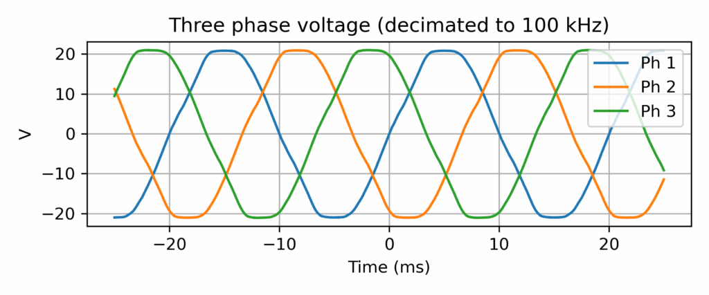
Three-phase grid voltage record (output of a 15Vrms transformer) at CentraleSupélec, Rennes campus
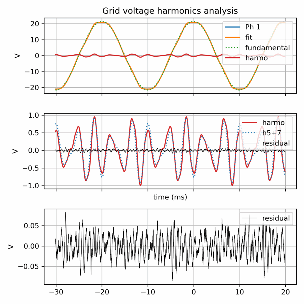
Grid voltage harmonics analysis
More grid voltage records data (by RTE)
That being said, after a tiny data survey, I found that RTE made available last year a dataset of 12053 records of grid records (specifically grid fault events), i.e. a much richer database! https://github.com/rte-france/digital-fault-recording-database
Context: grid connected inverter
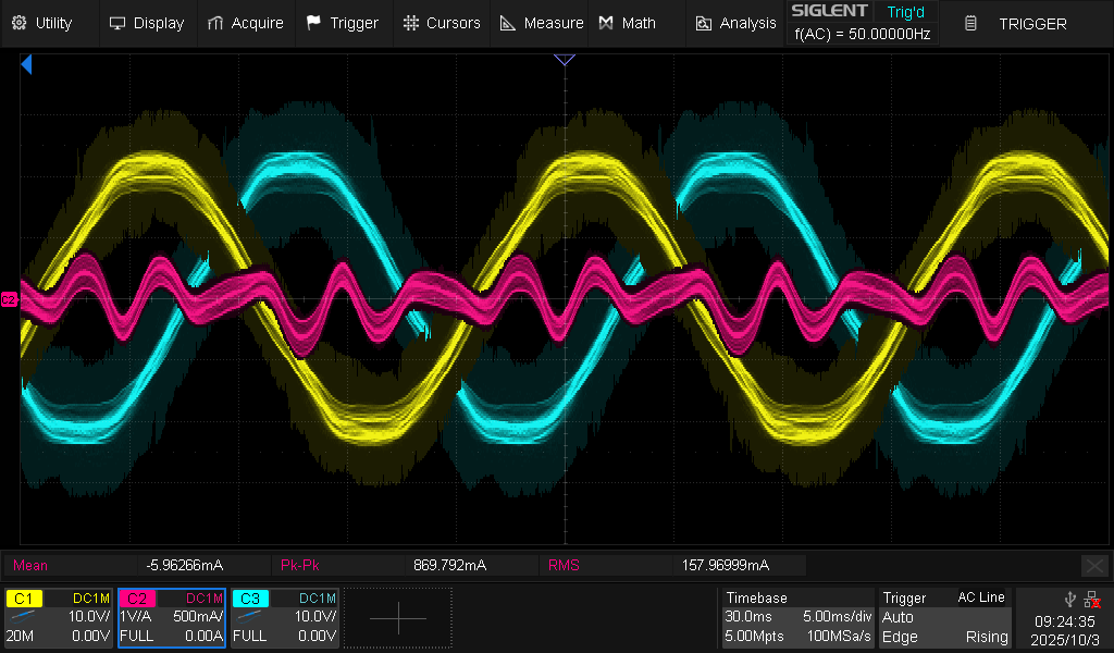
This was created in the context of another investigation: the harmonic current perturbation in a grid connected inverter. And in the end: the harmonic current looks indeed proportional to the harmonic voltage, so the grid imperfection (albeit perfectly within compliance standards) is the likely cause (along with the simplistic inverter control which make no effort to reject harmonics)...
Oscilloscope record of harmonic current perturbation in a grid connected inverter (grid following current control, with current set point equal to 0.0 A)
This post is meant to help people in search of a refurbished notebook. Indeed, it’s easy to get lost in the processors references (“how does an Intel Core i5-8250U compares to an i5-10210U?” Spoiler: they are almost the same!). It is the outcome of me researching whether it is worth replacing my Lenovo Thinkpad T470 notebook, a 2017 model bought 2nd hand in 2020. While the conclusion is that I’ll probably wait a bit more, this was a nice data research about the evolution of the computing power of office notebooks over the last decade.
In this post, I focus on key results while the full dataset and associated Python code is available in the GitHub repository https://github.com/pierre-haessig/notebook-cpu-performance/. Also, there is a CPUs table, with characteristics and performance scores hosted on Baserow. Testing this so-called “no-code” cloud database was an additional excuse for this project... While I don’t want to comment my experience here, I’ll just say I found it a neat alternative to spreadsheets for doing database-style work (e.g. creating links between tables).
Dataset description
About the scores: I’ve extracted computing performance scores from the Geekbench 6 data browser https://browser.geekbench.com/ which conveniently make their database public (in exchange of Geekbench users automatically contributing to the database for free). This test provides two scores:
Single-Core score is useful to assess the execution speed of one application (webmail, text editor, spreadsheet...)
Multi-Core score is geared towards multitasking (or some computations which can exploit all processor cores like video encoding, I believe).
Geekbench explains that these scores are proportional to the processing speed, so a score which is twice as large means a processor that is twice as fast, that is a computing task completed in half the time, if I got it right.
About the processors selection: I’ve extracted the scores for CPUs found in typical refurbished office notebooks, that is midrange & low power CPUs, aka Intel Core i5 processors, from the so-called U series, but also corresponding AMD Ryzen 5. The earliest model is the Intel Core i5-5200U launched in 2015, while the most recent is the Intel Core Ultra 125U/135U from late 2023 (there wasn’t enough data for the 2024 Intel Core Ultra 2xx models). Notice that there are no refurbished notebooks of 2023 yet on the market, so there is some amount of guessing on what will be the "typical office notebook CPUs" of 2023-2025.
CPU performance charts
Enough speaking, here are two graphs of processor performance.
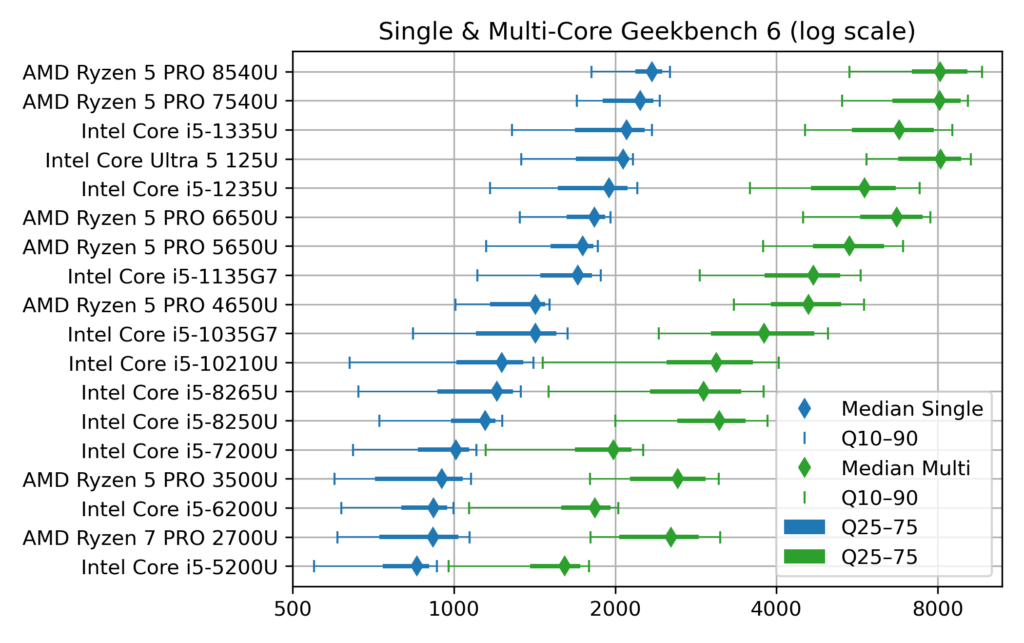
1) Ranked CPU performance
First a dot plot/boxplot chart showing CPU performance, ranked by Single-Core performance (which is close, but not quite, the same as the Multi-Core rank):
Chart of Geekbench CPU performance of typical office notebooks
The horizontal scale for the score is logarithmic, so that each vertical grid line means a difference by a factor 2. This allows superimposing Single-Core (blue) and Multi-Core (green) data.
The diamonds are the median scores, while the lines show the variability. Indeed, there is no unique value for each CPU, due to the many factors which can affect computing performance: temperature, power source (battery vs. AC adapter) and energy saving policy (max performance vs. max battery life). To account for this, I’ve collected about 1000 samples for each CPU and summarized them by computing quantiles. The thick lines show the quantiles 25%–75% (also called interquartile range, which contains half the samples) while the thin line ended by mustaches shows the quantiles 10%–90% (the most extreme deciles which contain 80% of the samples).
Notice that to avoid data overcrowding, this the “short” version of the chart where I picked one CPU model per generation, while there are typically two (like i5-1135 and i5-1145, with very close performance). The full chart variant (twice as long) can be found in the chart repository, along with the variants sorted by Multi-Core score.
2) CPU performance over time, with trend
The second chart shows the evolution of CPU performance over time. Only the median score is shown here, to avoid overcrowding the graph, but with all the CPU models of the dataset. This graph is interactive (perhaps a mouse is required, though): hovering each point reveals the processor name and details like the number of cores.
[EDIT: for some unknown reason, the tooltip which is suppose to appear when hovering points has an erratic display (pops up a large blank rectangle). In the mean time, I've put the charts on a dedicated page which works fine]
Vega viz of CPU performance over time, linear scale
The dot color and shape discriminate the CPU designer: Intel vs. AMD (the classical term “manufacturer” is not appropriate for AMD, neither for the latest Intel products). The gray dotted line shows the exponential trend, that is a constant-rate growth trends, in the spirit of Moore’s law (doubling every 2 years), albeit with a much smaller rate, see values below.
This second plot was done with Vega-Altair which is very nice for data exploration and interactivity. However, it is perhaps a bit less customizable than my “old & reliable” plotting companion, Matplotlib, used for the first chart. In particular, I didn’t manage to replicate to the nice log2 scale, created by manually setting the ticks position and label (see Retrieve_geekbench.ipynb notebook, “Log2 scale variant”), but could be achieved more cleanly with Matplotlib’s tick formatter. So here is the log2 variant of the performance over time chart, albeit with the raw log2 scores. With this scale, the exponential trend becomes a straight line.
Vega viz of CPU performance over time, log scale
How to read these raw log2 scores: values [0, 1, 2, 3] correspond to [1000, 2000, 4000, 8000], while the general formula is y = 1000 × 2x. Also, because there are grid lines for half scores (0.5→1000×√2 ≈ 1414), scores which are different by factor 2 are here separated by two grid lines instead of just one in the first plot.
Comments of CPU performance
What can be said from the charts above?
1) General trend
Sure, there has been some progress in CPU performance over the decade!
but the progress is faster for Multi-Core than Single-Core performance. In detail, the exponential trend fitting yields:
Single-core trend: +12% per year (±1%), or, said differently, a time to double the performance of about 6.25 years (±10 months)
Multi-core trend: +20%/y ±2%/y, or a time to double the performance of about 3.75 years (±4 months)
→ In both cases, the growth well slower than the 2 years (that is +41%/y) of Moore’s law.
2) Effect of increased core count
There is a clear effect of diminishing returns within the general trend to add more CPU cores:
From about 2010 until 2017 (ending with Intel 7th gen Core i5-7*00U), notebook CPUs shipped with 2 cores, with a Multi-Core score ending close to twice the Single-Core one (2000 vs 1000 for Intel Core i5-7300U)
From 2018 to 2021, notebook CPUs had 4 cores, but with Multi-Core to Single-Core scores ratio between 2.5 and 3.0 (at least for median scores)
Fast-forward to 2024, the most recent CPUS come with 6 (AMD) or even 10–12 cores (Intel, albeit with only 2 P[owerful] cores), and the Multi-Core score finally gets close to 4 times the Single-Core one (8000 vs. 2000 for Core Ultra 125U).
3) Off the trend
The exponential fits gives a false sense of a smooth progress in performance, while the true evolution is a bit more stepwise, with some processors “lagging behind” and others “ahead of their time”:
AMD CPUs before 2020 (Ryzen 7 PRO 2700U and Ryzen 5 PRO 3500U) are lagging behind their Intel counterpart, especially for Single-Core performance. Successors have closed the gap (notably with the Ryzen 5 PRO 5650U).
From 2018 to 2020, Intel has kept releasing “re-re-refreshed” versions of its 2017 Kaby Lake (7th gen) architecture, so that the difference between the Intel Core i5-8250U (mid 2017), i5-8265U (mid 2018) and i5-10310U (early 2020) is pretty thin.
Performance of Intel processors makes nice leaps with the 11th and 12th gen (Core i5 11*5G7 and 12*5U), but things get more mixed starting 2023 with the new branding of “Core Ultra” processors, which comes with more variants (V and U series in the 2nd gen). Time will tell how this evolves further.
4) About performance variability
Up to this point, I’ve only commented the median score, while deferring the discussion about performance variability shown on the first plot.
First things first: the performance variability of notebook CPUs is quite large, with almost a factor 2 between the top 10% and bottom 10% (90% and 10% quantiles)
The Single-Core score distribution is left-skewed, that is the median and top 10% scores are often close together, while most variability comes in the left tail of low scores. My interpretation is that the top score indicates the rated chip performance and the fact that the median is quite close means that about half the notebooks ride close to it. This means that it’s quite easy to experience this rated performance in practice. Still, the bottom half can get much slower, but perhaps these are cases where notebooks are running in a “low power/max battery life” setting. If that’s the case, it is not bad news, because notebook processors are designed to dynamically adjust their frequency & voltage to save energy.
This is why I always advise my students facing an unresponsive notebook to plug their AC adapter, especially when I make them run some microgrid optimization code.
Still, my father experienced a disappointingly low score of 1200 with its i5-1245U powered laptop (median score is 1950), while we took care to plug the AC adapter and set the power strategy to max performance.
The Multi-Core score distribution is, on the other hand, much more symmetric. I interpret this as meaning that it may be more difficult to reach the rated Multi-Core performance, at least with notebook CPUs. I guess that when all cores works simultaneously, the processor easily hits its maximum power or temperature limits, while one core working alone has much more to “express its talent”
What is left to be explored is the effect of notebook’s chassis. Seeing for example the pretty large variability of Intel Core i5-10210U, perhaps there exists clusters showing that the bottom performance comes from some models. Indeed, part of the power management of notebooks is under the control of the manufacturer. Question example: out of the Dell Latitude 5410 and the HP ProBook 440 G7 which both feature this CPU, is one better than the other?
Conclusion
Et voilà, I guess that’s enough for one post. Of course I only covered computing metrics. For example, when I said in the intro that Intel Core i5-10210U and i5-8250U are almost the same, these processors are still 2 years apart and the corresponding notebooks may come with different Wifi and Bluetooth connection standards, so that the more recent10210U may still be more interesting.
In a following post, I will write on the second part of this dataset: the notebook offers table, which links the system price to its CPU performance, to get Pareto-style trade-off chart of price vs. performance. Notice that this dataset and the draft plotting code are already available in the repository (Offers_plot.ipynb notebook and Baserow Notebook offers table).
These last weeks, I’ve read William S. Cleveland book “The Elements of Graphing Data”.
I had heard it’s a classical essay on data visualization.
Of course, on some aspects, the book shows its age (first published in 1985), for example
in the seemingly exceptional use of color on graphs.
Still, most ideas are still relevant and I enjoyed the reading.
Some proposed tools have become rather common, like loess curves.
Others, like the many charts he proposes to compare data distributions (beyond the common histogram),
are not so widespread but nevertheless interesting.
One of the proposed tools I wanted to try is the (Cleveland) dot plot.
It is advertised as a replacement of pie charts and (stacked) bar charts, but with a greater visualization power.
Cleveland conducted scientific experiments to assess that superiority, but it’s not detailed in the book (perhaps it is in the Cleveland & McGill 1984 paper).
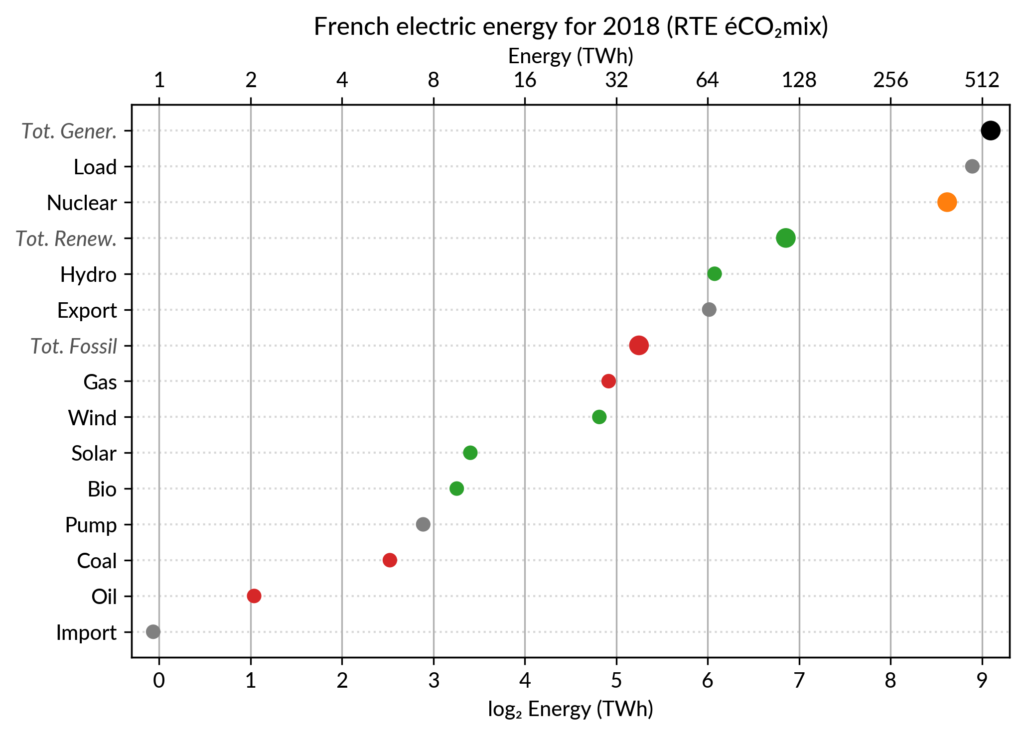
I’ve explored the visualization power of dot plots using the French electricity data from RTE éCO₂mix (RTE is the operator of the French transmission grid).
I’ve aggregated the hourly data to get yearly statistics similar to RTE’s yearly statistical report on electricity (« Bilan Électrique »).
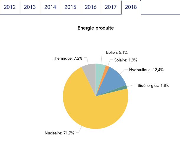
The case for dot plot
Such yearly energy data is typically represented with pie charts to show the share of each category of power plants. This is RTE’s pie chart for 2018 (from the Production chapter):
However, Cleveland claims that the dot plot alternative enables more efficient reading of single point values
and also easier comparison of different points together. Here is the same data shown with a simple dot plot:
I’ve colored plant types by three general categories:
Fossil (gas, oil and coal) in red
Renewable (hydro, wind, solar and bioenergy) in green
Nuclear in orange
Subtotals for each category are included.
Gray points are either not a production (load, exports, pumped hydro) or cannot be categorized (imports).
Compared to the pie chart, we benefit from the ability to read the absolute values rather than just the shares.
However, how to read those shares?
This is where the log₂ scale, also promoted by Cleveland in his book, comes into play. It serves two goals. First, like any log scale, it avoids the unreadable clustering of points around zero
when plotting values with different orders of magnitude.
However, Cleveland specifically advocates log₂ rather than the more
common log₁₀ when the difference in orders of magnitude is small (here
less than 3, with 1 to 500 TWh) because it would yield a too small
number of tick marks (1, 10, 100, 1000 here) and also because log₂ aids reading ratios of two values:
a distance of 1 in log₂ scale is a 50% ratio
a distance of 2 in log₂ scale is a 25% ratio
…
Still, I guess I’m not the only one unfamiliar with this scale, so I made myself a small conversion table:
Δlog
ratio a/b (%)
ratio b/a
0.5
71% (~2/3 to 3/4)
1.4
1
50% (1/2)
2
1.5
35% (~1/3)
2.8
2
25% (1/4)
4
3
12%
8
4
6%
16
5
3%
32
6
1.5%
64
As an example, Wind power (~28 TWh) is at distance 2 in log scale of
the Renewable Total, so it is about 25%. Hydro is distant by less than
1, so ~60%, while Solar and Bioenergies are at about 3.5 so ~8% each.
Of course, the log scale blurs the precise value of large
shares. In particular, Nuclear (distant by 0.5 to the total generation)
can be read to be somewhere between 65% and 80% of the total, while the
exact share is 71.2%. The pie chart may seem more precise since
the Nuclear part is clearly slightly less than 3/4 of the disc.
However, Cleveland warns us that the angles 90°, 180° and 270° are
special easy-to-read anchor values whereas most other values are in fact
difficult to read.
For example, how would I estimate the share of Solar in the pie chart
without the “1.9%” annotation? On the log₂ scaled dot plot, only a
little bit of grid line counting is necessary to estimate the distance
between Solar and Total Generation to be ~5.5, so indeed about 2% (with
the help of the conversion table…).
The bar chart alternative?
Along with the pie chart, the other classical competitor to dot plots is the bar chart.
It’s actually a stronger competitor since it avoids the pitfall of the poorly readable angles of the pie chart.
I (with much help from Cleveland) see three arguments for favoring dots over bars.
The weakest one may be that dots create less visual clutter. However, I see a counter-argument that bars are more familiar to most viewers, so if it were only for this, I may still prefer using bars.
The second argument is that the length of the bars would be meaningless.
This argument only applies when there is no absolute meaning for the
common “root” of the bars. This is the case here with the log scale. It
would also be the case with a linear scale if, for some reason, the zero
is not included.
The third argument is an extension of the first one (better clarity) in the case when several data points for each category must be compared. Using bars there are two options:
drawing bars side by side: yields poor readability
stacking bars on top of each other (if the addition makes
sense like votes in an election): makes a loss of the common ground,
except for the bottom most bars (of left most bars when using the
horizontal layout like here)
This brings me to the case where dot plots shine most: multiway dot plots.
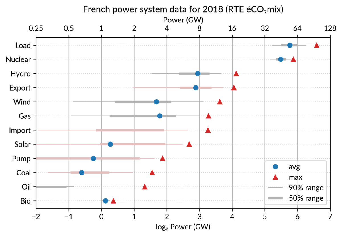
Multiway dot plots
The compactness of the “dot” plotting symbol (regardless of the
actual shape: disc, square, triangle…) compared to bars allows
superposing several data points for each category.
Cleveland presents multiway dot plots mostly by stacking horizontally
several simple dot plots. However, now that digital media allows high
quality colorful graphics, I think that superposition on a single plot
is better in many cases.
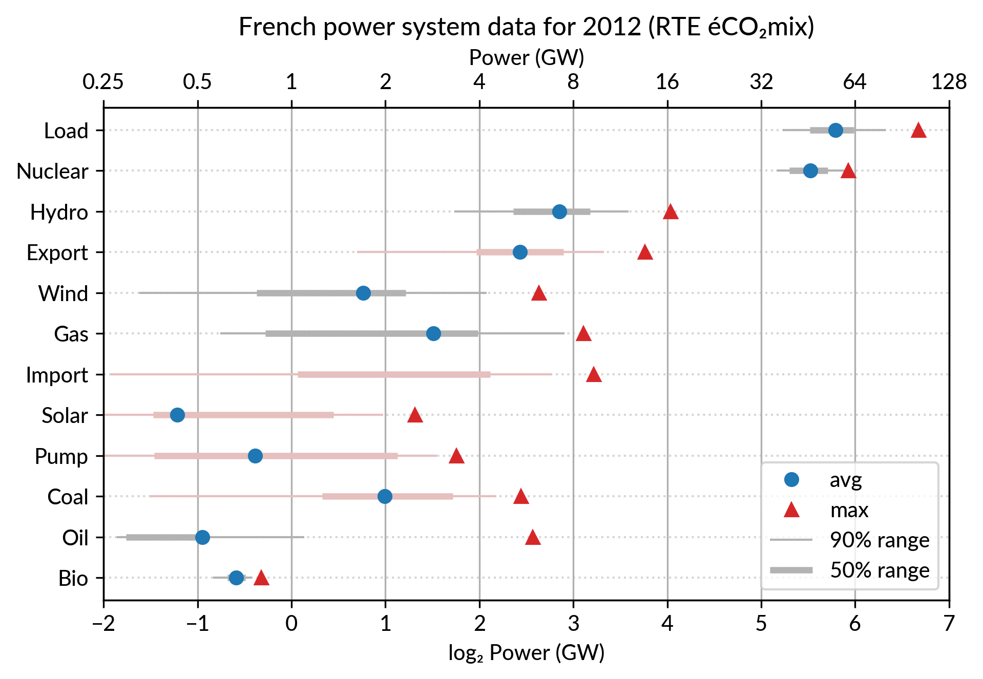
For the electricity data, I plot for each plant category:
the maximum power over the year (GW): red triangles
the average power over the year (GW): blue discs
The maximum power is interesting as a proxy to the power capacity.
The average power is simply the previously shown yearly energy production data, divided by the duration of the year.
The benefit of using the average power is that it can be superimposed
on the plot with the power capacity since it has the same unit.
Also, the ratio of the two is the capacity factor of the plant category, which is a third interesting information.
Since it is recommended to sort the categories by value (to ease comparisons), there are two possible plots:
plot sorted by the maximum powers (~capacity)
plot sorted by the average powers (equivalent to the cumulated energy for the year)
The two types of sorts are slightly different (e.g. switch of Wind and Gas) and I don’t know if one is preferable.
Adding some quantiles
Since I felt the superposition of the max and average data was
leaving enough space, I packed 4 more numbers by adding gray lines
showing the 90% and 50% range of the power distribution over the year.
With these lines, the chart starts looking like a box plot, albeit pretty non-standard.
However, I faced one issue with the quantiles: some plant categories
are shut down (i.e. power ≤ 0) for a significant fraction of the year:
Solar: 52% (that is at night)
Coal: 29% in 2018
Import: 96% (meaning that the French grid was net-importing electricity from its neighbors only 4% of the year in 2018)
To avoid having several quantiles clustered at zero, I chose to
compute them only for the running hours (when >0). To warn the
viewer, I drew those peculiar quantiles in light red rather than gray.
Spending a bit more time, it would be possible to stack on the right a
second dot plot showing just the shutdown times to make this more
understandable.
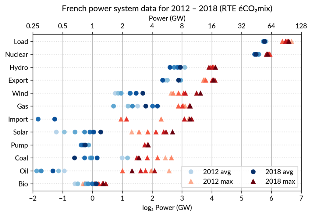
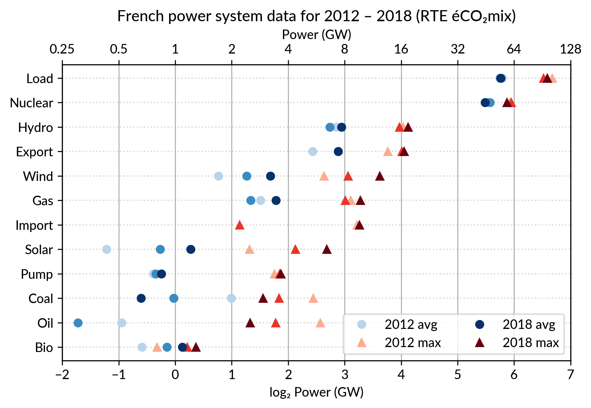
Animated dot plots
Again trying to pack more data on the same chart, I superimposed the statistics for several years.
RTE’s data is available from 2012 to 2018 (2019 is still in the making…) and the year can be encoded by the lightness of the dots.
I think it is possible to perceive interesting information from this
chart (like the rise of Solar and Wind along the drop of Coal), but it
may be a bit too crowded.
With only two or three years (e.g. 2012-2015- 2018), it is fine though.
A better alternative may be to use an animation. I tried two solutions:
GIF animation generated from the sequence of plots for each year
Interactive plot with the highlight of each year with mouse interaction using Altair
GIF animation
To assemble a set of PNG images (Dotplot_2012.png to Dotplot_2018.png) into a GIF animation,
I used the following “incantation” of ImageMagick:
The -delay 30 option sets a frame duration of 30/100 seconds, so about 3 images/s.
The result is nice but it is not possible to pause on a given year for a closer inspection.
Using a video file format instead of GIF, pausing would be possible, but a convenient way
to browse through the years would be much better.
Interactive dot plots with Altair/Vega
For a true interactive plot, I’ve played with Altair, the Python package based on the Vega/Vega-Lite JavaScript libraries.
It’s the second or third time I experiment with this library
(all the other plots are made with Matplotlib).
I find Altair appealing for its declarative programming interface
and the fact it is based on a sound visualization grammar. For example, it is based on a well-defined notion of visual encoding channels: position, color, shape…
For the present task, I wanted to explore more particularly the declarative description of interactivity, a feature added in late 2017/early 2018 with the release of Vega-Lite 2.0/Altair 2.0.
Here is the result, illustrated by a screencast video before I get to know
how to embed a Vega-Lite chart in WordPress:
Here fields=['year'] means that hovering one point will automatically select
all the data samples having the same year.
Then, the selection object is to be appended to one or several charts
(so that the selection works seamlessly across charts).
This is no more than calling .add_selection(selector) on each chart.
Finally, the selection is used to conditionally set the color of plotting marks,
or whatever visual encoding channel we may want to modify (size, opacity…).
A condition
takes a reference to the selection and two values: one for the selected case, the second when unselected.
Here is, for example, the complete specification of the bottom chart which
serves as a year selector:
years = base.mark_point(filled=True, size=100).encode(
    x='year:O',
    color=alt.condition(selector,
                        alt.value('green'),
                        alt.value('lightgray')),
).add_selection(selector)
The Vega-Lite compiler takes care of setting up all the input handling logic to make the interaction happen.
A few days ago, I happen to read a Matlab blog post on creating a linked selection
which operates across two scatter plots. As written in that post,
“there’s a bit of setup required to link charts like this, but it really
isn’t hard once you’ve learned the tricks”.
This highlights that the back-office work of the Vega-Lite compiler is
really admirable.
Notice that doing it in Python with Matplotlib would be equally verbose,
because it is not a matter of programming language but of imperative versus declarative plotting libraries.
Notes
Other discussions on dot plots
Here are the few other pages I found on Cleveland’s dot plots,
one with Tableau and one with R/ggplot:
I created the plots using RTE éCO₂mix
hourly records to generate the yearly statistics.
For a unknown reason, when I sum the powers over the year 2018,
I get slightly different values compared to RTE’s official 2018 statistical report on electricity (« Bilan Électrique 2018 »).
For example: Load 478 TWh vs 475.5 TWh, Wind 27.8 TWh vs 28.1 TWh…
I don’t like having such unexplained differences,
but at least they are small enough to be almost invisible in the plots.
